- MD5值:
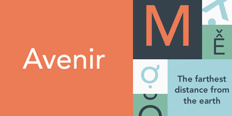
Avenir®
英文名字:AvenirLTPro-Light.TTF
字體介紹
Avenir®
品牌:Linotype(Monotype)
設計師:Frutiger,Adrian
發行時間:2016
字庫編碼:Unicode
分類:無襯線體、正文字體
字體屬性:
經過對無襯線字體多年持久的興趣,Adrian Frutiger於1988年設計瞭Avenir™。在接受Linotype的一次采訪時,他說他覺得有義務設計一款能夠傳承Erbar和Futura的線性無襯線字體,還要利用20世紀的經驗和風格演變。在法語中,Avenir一詞的意思是“未來”,暗示瞭該字體對Futura的詮釋。但與Futura不同,Avenir不是純粹的幾何形狀; 它的垂直筆劃要比水平筆劃粗,字母“o”不是一個正圓,且升部被縮短瞭。這些細微差別有助於提高易讀性,並使Avenir在文本和標題中都顯得和諧、得體。2004年,Adrian Frutiger和Linotype GmbH的字型總監Akira Kobayashi(小林章)重新設計瞭Avenir並為Platinum Collection創作瞭Avenir Next。
Adrian Frutiger designed Avenir™ in 1988, after years of having an interest in sans serif typefaces. In an interview with Linotype, he said he felt an obligation to design a linear sans in the tradition of Erbar and Futura, but to also make use of the experience and stylistic developments of the twentieth century. The word Avenir means ‘future’ in French and hints that the typeface owes some of its interpretation to Futura. But unlike Futura, Avenir is not purely geometric; it has vertical strokes that are thicker than the horizontals, an """"o"""" that is not a perfect circle, and shortened ascenders. These nuances aid in legibility and give Avenir a harmonious and sensible appearance for both texts and headlines. In 2004 Adrian Frutiger and the type director of Linotype GmbH Akira Kobayashi reworked the Avenir and created the Avenir Next for the Platinum Collection.
字體圖片