- MD5值:
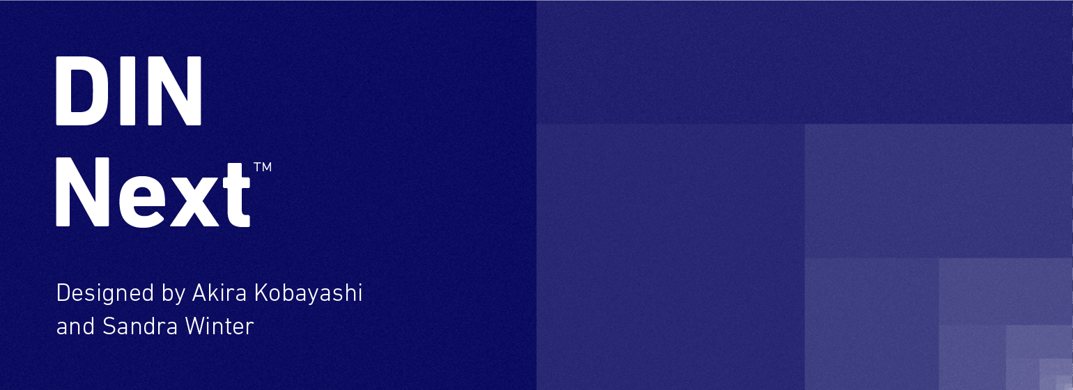
DIN® Next
英文名字:DINNextLTPro-UltraLight.TTF
字體介紹
DIN® Next
品牌:Monotype
設計師:Kobayashi,Akira; Winter,Sandra
發行時間:2017
字庫編碼:Unicode
分類:無襯線體
字體屬性:
DIN Next是一個字體傢族,靈感來自經典的工業德國工程設計,DIN 1451 受EngsChrIFT和MtelsChrIFT啟發。Akira Kobayashi開始修改這兩個面貌,他們的名字意味著“濃縮”和“規則”,然後擴展到一個新的傢族,有七個重量(從細Light 到 黑Black)。每一種字重都有三種:普通的、斜體的和濃縮的,使DIN下一個傢族的字體總數達到21個。DIN是LyType的白金傢族的一部分。自1980以來,LYNYPE一直為客戶提供兩種DIN 1451字體。最近,他們變得比以往任何時候都更受歡迎,設計師經常要求額外的字重。縮寫“DIN”代表德意志研究所F UR NunMung E.V.,這是德國工業標準化研究所。1936年,德國標準委員會將DIN 1451定為技術、交通、行政和商業領域的標準字體。該設計用於德國的街道路牌標志和房屋號碼上使用。該委員會希望要一個無襯線字體,認為它會更清晰、簡單、易於復制。他們不打算將設計用於廣告和其他藝術導向的目的。盡管如此,由於DIN 1451在德國各地都能看到城鎮名稱和交通方向的標志,所以它已經足夠熟悉,可以進入平面設計師和廣告藝術總監的調色板。DIN 1451的數字版本將繼續被其他國傢的設計師采用和使用,鞏固其在世界范圍內的設計聲譽。與DIN 1451原版相比,Din Next的字母有很多細微的差別。這些都是由Kobayashi添加,使新的傢族在二十一世紀媒體更通用。例如,雖然DIN 1451的角都是尖角,但DIN接下來將它們全部略圓化。不過,即使這種軟化也是對DIN 1451過去的一部分的認可。許多使用DIN 1451的標志都是用尖角切割的,不能制造完美的角;圓角的頭最好切成圓角。Linotype的DIN 1451 EngsChrIFT和MITTELSCRIFT由德國DIN研究所認證官方標志項目使用。由於DIN接下來是一個新的設計,這些應用在德國是不可能的。然而,DIN接下來可以用於任何其他項目,並且它可以用於任何其他國傢的工業標牌!DIN Next是專門為圖形設計者定制的,但是它的工業遺產使得它在任何應用程序中都有驚人的功能。
DIN下一個傢族已經擴展瞭七個阿拉伯語字重和五個梵文字重。在網站上的梵文字體顯示字體無法顯示字體的所有特征,因此不能正確顯示所有語言特征。
DIN Next is a typeface family inspired by the classic industrial German engineering designs, DIN 1451 Engschrift and Mittelschrift. Akira Kobayashi began by revising these two faces-who names just mean "condensed" and "regular" before expanding them into a new family with seven weights (Light to Black). Each weight ships in three varieties: Regular, Italic, and Condensed, bringing the total number of fonts in the DIN Next family to 21. DIN Next is part of Linotype’s Platinum Collection. Linotype has been supplying its customers with the two DIN 1451 fonts since 1980. Recently, they have become more popular than ever, with designers regularly asking for additional weights.The abbreviation "DIN" stands for "Deutsches Institut für Normung e.V.", which is the German Institute for Industrial Standardization. In 1936 the German Standard Committee settled upon DIN 1451 as the standard font for the areas of technology, traffic, administration and business. The design was to be used on German street signs and house numbers. The committee wanted a sans serif, thinking it would be more legible, straightforward, and easy to reproduce. They did not intend for the design to be used for advertisements and other artistically oriented purposes. Nevertheless, because DIN 1451 was seen all over Germany on signs for town names and traffic directions, it became familiar enough to make its way onto the palettes of graphic designers and advertising art directors. The digital version of DIN 1451 would go on to be adopted and used by designers in other countries as well, solidifying its worldwide design reputation. There are many subtle differences in DIN Next’s letters when compared with DIN 1451 original. These were added by Kobayashi to make the new family even more versatile in 21st-century media. For instance, although DIN 1451’s corners are all pointed angles, DIN Next has rounded them all slightly. Even this softening is a nod to part of DIN 1451’s past, however. Many of the signs that use DIN 1451 are cut with routers, which cannot make perfect corners; their rounded heads cut rounded corners best. Linotype’s DIN 1451 Engschrift and Mittelschrift are certified by the German DIN Institute for use on official signage projects. Since DIN Next is a new design, these applications within Germany are not possible with it. However, DIN Next may be used for any other project, and it may be used for industrial signage in any other country! DIN Next has been tailored especially for graphic designers, but its industrial heritage makes it surprisingly functional in just about any application.
The DIN Next family has been extended with seven arabic weights and five Devanagari weights. The display of the Devanagari fonts on the website does not show all features of the font and therefore not all language features may be displayed correctly
字體圖片