- MD5值:
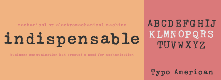
Linotype Typo American™
英文名字:TypoAmericanCom.TTF
字體介紹
Linotype Typo American™
品牌:Linotype(Monotype)
設計師:Stanczyk,Mark
發行時間:2018
字庫編碼:Unicode
分類:
字體屬性:
1999年,Mark Stanczyk設計瞭字體Linotype Typo American。該字體是對美式打字機字體的完美復刻。正如我們大多數人對於童年時代的記憶或者通過古老的故事和電影所記得的那樣,每個人在計算機發明之前都曾經使用過打字機。與計算機不同,大多數個人打字機隻有一種字形或字體可供選擇。更糟糕的是,打字機中的字母會隨著使用而磨損。隨著時間的流逝,在打字機上打出來的文本看起來越來越腐蝕、陳舊且不均勻。Stanczyk在這款復刻的字體中徹底捕捉到瞭這些特征!
與大多數老式打字機一樣,Linotype Typo American的字母都是等寬的,即字母i與字母w的寬度相同。打字機字母也都傾向於使用相同的大小-大約12pt左右。使用打字機風格的字體時,最好保持文本大小一致(當然,您也可以使用Linotype Typo American設置非常大的、有趣的標題;如果有什麼不同的話,那便是設計的不均勻性會在這些應用中表現得更加明顯。
Mark Stanczyk designed Linotype Typo American in 1999. The font is an excellent revival of American style typewriter type. As most of us can remember from our childhood years, or through old stories and movies, everyone used to type with typewriters before the invention of computers. Unlike computers, most individual typewriters only had one typestyle, or font, to chose from. To make matters worse, the letters in a typewriter font would wear down with use. Over time, text typed out on a typewriter would look more and more corroded, old, and uneven. Stanczyk has captured exactly these features in this revival" font!
Also like most older typewriter styles, Linotype Typo American’s letters are all mono-spaced, i.e., the letter i is the same width as the letter w. Typewriter letters also all tended to be cast in the same size – around 12 points or so. When using typewriter-style fonts, it is best to keep setting your text in similar sizes (of course, you can set really large and fun headlines with Linotype Typo American, too; if anything the unevenness of the design will come even more across in these applications)."
字體圖片

