- MD5值:
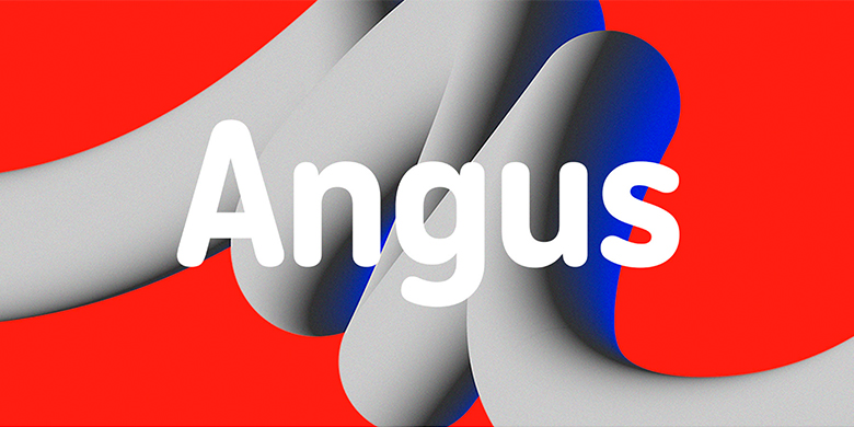
Angus
英文名字:Angus-Light.TTF
字體介紹
Angus
品牌:Black[Foundry]
設計師:Elliott Amblard
發行時間:2018
字庫編碼:Unicode
分類:無襯線體
字體屬性:
Angus是一類圓形的字體,但並不是將現有字體圓角化的結果。它從一開始就設計瞭這些非常令人愉悅的圓形筆端並已發展成為一個字體傢庭,其中包括五種字重,從輕到重,以及與之匹配的斜體。由於其多種特點,Angus用起來令人興奮,並且非常方便。由於字母從一種樣式到另一種樣式具有相同的寬度,因此更改字體粗細時,文本不會重排,Angus在整個傢庭中表現出多樣性:粗體的文本看起來大方而有趣,而最輕的顯示文本則顯得柔和。字體的獨特個性在於其緊湊的比例和均勻的外觀,在圓度和筆直度之間實現瞭很好的平衡。整個傢族都很給人友好和快樂的感覺。小寫字母“ j”的下伸部,小寫字母“ t”的彎曲結尾端以及連字“ ri”和“ rt”這些都是使字體在大尺寸中有吸引力,在文本大小中保持平滑的特征元素。令人愉悅的外觀,讓Angus安格斯是一個能完美的匹配任何休閑溝通的字體,並在包裝和數字內容方面也有著極棒的表現。
Angus is a rounded typeface but is not the result of the rounding of an existing one. It was designed from the start with these very enjoyable round terminals and has grown to a family which includes five weights, from light to extra bold, with their matching italics. Thanks to its multiplex feature, Angus is exciting to play with and really convenient to use. Text doesn’t reflow when changing font weight since letters share the same width from one style to another. Angus shows diversity across the family: texts set in bold weights look generous and playful whereas texts set in the lightest weight ares ofter and speak with a more serious voice. The typeface’s unique personality lies in its condensed proportions and monospaced look which bring a great balance between roundness and straightness. The whole family is approachable and joyful. The very short descender of the lowercase “j”, the curved ending of the lowercase “t” as well as the ligatures “ri” and “rt” are among the characteristic elements that make the typeface appealing in big sizes and smooth in text sizes. With its cheerful look, Angus is a perfect match for any casual communication and performs especially well on packaging and digital content.
字體圖片

