- MD5值:
Nami®
英文名字:NamiCom-Light.TTF
字體介紹
Nami®
品牌:Linotype(Monotype)
設計師:Frutiger,Adrian; Kobayashi,Akira
發行時間:2018
字庫編碼:Unicode
分類:無襯線體、正文字體
字體屬性:
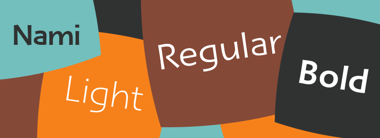
Nami,日語中的“wave”的意思,是Adrian Frutiger與Linotype字體總監小林章(Akira Kobayashi)的最新合作。這種字體傢族是Adrian Frutiger有史以來最具人文主義的無襯線設計,它有一個有趣的轉變:lapidary的替代字符可以在OpenType-savy應用的幫助下進行瀏覽。Adrian Frutiger在20世紀80年代就開始瞭這一設計,後來發展為Nami。盡管它沒有在20世紀生產,但它是一種非常超前的想法。該字體包括幾個看起來很前衛的替代字符;這些是常見的字母形式的“lapidary”版本。2006年,當小林章(Akira Kobayashi)重新設計該項目時,他把這個概念重新設計為一個包含三種字體的傢族。每種字體包含483種字形,包括11種變體——小寫g的兩種額外形式,以及a、e、h、l、m、n、r、t和u的新形式。”。
Nami, the Japanese word for wave," is the latest collaboration between Adrian Frutiger and Linotype’s Type Director, Akira Kobayashi. This typeface family is the most humanistic sans serif design ever to come from Adrian Frutiger, and it has an interesting twist: lapidar alternates that may be surfed through with the help of OpenType-savy applications. Adrian Frutiger began the design that would blossom into Nami during the 1980s. Although it would not be produced during the 20th century, it was quite forward thinking. The typeface included several seemingly avant garde alternates; these were "lapidary" versions of common letterforms. Revisiting the project in 2006, Akira Kobayashi reworked the concept into a working family of three typefaces. Each font contains 483 glyphs, including 11 alternates-two extra forms of the lowercase g, as well as new forms for a, e, h, l, m, n, r, t, and u."
字體圖片

