- MD5值:
Laurentian™
英文名字:AM252___.TTF
字體介紹
Laurentian™
品牌:Monotype
設計師:McDonald,Rod
發行時間:2018
字庫編碼:Unicode
分類:襯線體
字體屬性:
Maclean’s是加拿大一傢新聞雜志周刊。它涉及到從地球另一端的暴力事件到當地出產最大南瓜的一切新聞。
2001年,Maclean邀請Rod McDonald加入設計團隊,對“96歲的出版物”進行更新。該雜志旨在為讀者提供一種專業的、簡潔且易於閱讀的印刷風格,最重要的是,字體必須能夠講述每一期涉及的數百個不相關的主題,同時保持可信度且毫不造作。
這也許是個艱巨的任務吧?現在補充一下,這將是有史以來第一個由加拿大雜志委托制作的文本字體,McDonald,曾被認為是加拿大非官方的“typographer laureate”接受瞭這一挑戰。
McDonald使用瞭兩個歷史模型作為Laurentian設計的基礎:法國字體設計師Claude Garamond的作品,以及英國的印刷商兼字體設計師William Caslon的作品。從Garamond Laurentian那裡學習瞭人文主義的軸心,清晰的襯線以及模仿鋼筆筆畫的末端。Caslon的字母缺少人文氣息,筆畫粗細和襯線的對比更加明顯,看起來更像是結構化的而非繪制的。這些特點也在Laurentian這裡留下瞭印記。
以這兩種設計為基礎,McDonald以狹窄的文字欄和雜志創作使用的小號字體為出發點繪制瞭Laurentian。他為自己的字母設計瞭粗壯的垂直筆畫和堅固的襯線,高大的x高度以及略微壓縮的字符寬度。
從這款字體的易讀性、安靜有活力以及字母的開放性可以明顯看出McDonald的天賦。結果就產生瞭這樣一種字體:既滿足Maclean’s需求,而且還為其他各種應用提供瞭卓越的服務。
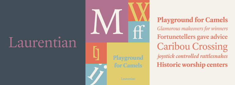
Laurentian有三種字重:Regular、Semi Bold和Bold, Regular和Semi Bold的補充斜體,以及一組標題大寫字母。”
Maclean’s is a weekly Canadian newsmagazine with a broad editorial mission. A typical issue covers everything from violence on the other side of the globe to the largest pumpkin grown in a local county.
In 2001, Maclean’s invited Rod McDonald to become part of the design team to renovate" the 96-year-old publication. The magazine wanted to offer its readers a typographic voice that was professional, clean, and easy to read. Above all, the typeface had to be able to speak about the hundreds of unrelated subjects addressed in each issue while remaining believable and uncontrived.
A tall order, perhaps? Now add in that this would be the first text typeface ever commissioned by a Canadian magazine. McDonald, who some have called Canada’s unofficial "typographer laureate," took on the challenge.
McDonald used two historic models as the basis for Laurentian’s design: the work of French type designer Claude Garamond, and that of the English printer and type founder, William Caslon. From Garamond Laurentian acquired its humanist axis, crisp serifs and terminals that mimic pen strokes. Caslon’s letters are less humanistic, with a more marked contrast in stroke weight and serifs that appear constructed rather than drawn. These traits also made their mark on Laurentian.
Using these two designs as a foundation, McDonald drew Laurentian with the narrow text columns and small type sizes of magazine composition in mind. He gave his letters strong vertical strokes and sturdy serifs, a robust x-height and a slightly compressed character width
A tall order, per McDonald’s genius is evident in the face’s legibility, quiet liveliness and in the openness of the letters. The result is a typeface that not only met Maclean’s demanding design brief, but also provides exceptional service in a wide variety of other applications.
Laurentian is available in three weights of Regular, Semi Bold and Bold, with complementary italics for the Regular and Semi Bold, and a suite of titling caps."
字體圖片

