- MD5值:
Airam™
英文名字:zhuan_AiramLTStd.TTF
字體介紹
Airam™
品牌:Linotype(Monotype)
設計師:Schmitt,MariaMartina
發行時間:2020
字庫編碼:Unicode
分類:無襯線體
字體屬性:
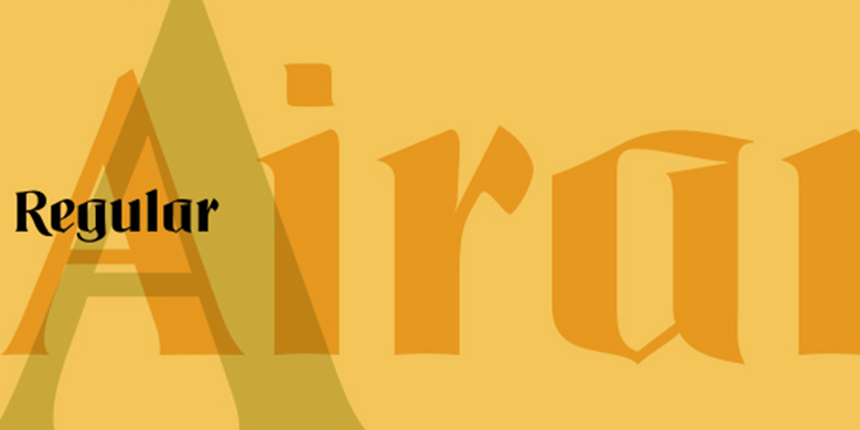
Airam將當代的易讀性與歷史上的哥特黑體字形式融合在一起,創作瞭一個與古老的歐洲歷史對話的當代文本字體。“哥特黑體”一詞指的是一種從北歐中世紀手稿傳統演變而來的字體風格。這些字母通常被稱為哥特字母,或者古英語,這些字母是通過其形狀中寬筆尖筆觸痕跡來識別。這種風格的字體通常表現出強烈的粗細筆畫對比。它們往往設置得較窄,使整個頁面呈現黑色調。而且,這些字母的筆畫在自然界中也很不連貫(實際上,德語中的blackletter術語是gebrochene Schriften-字面意思是不連貫的字母)。
為瞭符合這一要求,當把Airam放在一頁紙上時,它的顏色肯定比其他大多數當代文本的顏色要深。Airam的字體也有一些破損。它們顯示有角度的關節,而不是平滑的曲線。這個“破碎”的方面實際上有助於在更小尺寸上的易讀性。雖然Airam可能不適合整本書或整份報紙的排版,但這種字體會給短小的文本增加一種華麗的感覺。此外,Airam在大標題中看起來非常棒。
Airam於2002年由奧地利設計師Maria Martina Schmidt設計,並被Linotype GmbH收錄在Take Type 5傢族中。
Airam blends contemporary legibility with historic blackletter forms, creating a contemporary text face that speaks to the old European past. The term blackletter refers to a style of typefaces that evolved out of Northern Europe’s medieval manuscript tradition. Often called gothic, or Old English, these letters are identified by the traces of the wide-nib pen stroke within their forms. Typefaces designed in this style normally exhibit a drastic thick-thin stroke contrast. They tend to be set a bit narrow, leaving the appearance of a black tone across the page. The strokes of these letterforms also appear quite broken" in nature (indeed, the German term for blackletter – gebrochene Schriften – literally means broken letters).
To fit the bill, when set on a page, Airam certainly appears darker than most other contemporary text faces. Airam’s letterforms are slightly broken, too. They display angled joints in lieu of smooth curves. This "broken" aspect actually aids legibility at smaller point sizes. While Airam may not be suitable for setting whole books or newspapers, this font will add a splendid touch to short tracts of small text. Additionally, Airam looks superb in large headlines.
Airam was designed in 2002 by the Austrian designer Maria Martina Schmidt, and is included in the Take Type 5 collection from Linotype GmbH."
字體圖片