- MD5值:
Bodoni Classico™
英文名字:BodoniClassico.TTF
字體介紹
Bodoni Classico™
品牌:Linotype(Monotype)
設計師:Luin,Franko
發行時間:2018
字庫編碼:Unicode
分類:襯線體、正文字體
字體屬性:
Giambattista Bodoni(1740-1813)被稱為印刷之王; 他是一位多產的字體設計師、高超的雕刻師,也是當時最受歡迎的印刷商。他的書籍和字體都是在他擔任意大利Duke of Parma出版社發行印刷指導的45年間創作的。他基於那個時代最出色的作品創作瞭最優秀的現代風格字體。
現代風格字體代表瞭18世紀末和19世紀初排印的最終發展。它們的特征與之前的字體截然不同;比如,極端的垂直應力,精細的極細線與粗的主筆畫之間形成瞭鮮明對比,以及非常微妙的、幾乎不存在的清晰界定的極細襯線。
Bodoni將這種風格看作是美麗和諧的,用精良之筆書寫的自然結果,外觀時尚且令人贊嘆。 其他的字體設計師,如法國的Didot傢族(1689-1853)以及德國的J. E. Walbaum(1768-1839)也都制作瞭自己的現代風格字體。
盡管一些19世紀的批評傢們對此嗤之以鼻,稱這種字體是破碎的,冷酷的,但今天人們對Bodoni現代風格字體的看法與他所處的時代大體相同。如果使用慎重,Bodoni字體既浪漫又優雅,能為標題和廣告增添高雅的活力。
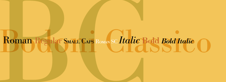
與其他版本的Bodoni字體相比,Franko Luin的Bodoni Classico™的細筆劃更粗。這些筆畫在較小尺寸下表現不錯,使這個字體傢族成為文本或字幕的理想之選。
Giambattista Bodoni (1740-1813) was called the King of Printers; he was a prolific type designer, a masterful engraver of punches and the most widely admired printer of his time. His books and typefaces were created during the 45 years he was the director of the fine press and publishing house of the Duke of Parma in Italy. He produced the best of what are known as modern" style types, basing them on the finest writing of his time. Modern types represented the ultimate typographic development of the late eighteenth and early nineteenth centuries. They have characteristics quite different from the types that preceded them; such as extreme vertical stress, fine hairlines contrasted by bold main strokes, and very subtle, almost non-existent bracketing of sharply defined hairline serifs. Bodoni saw this style as beautiful and harmonious-the natural result of writing done with a well-cut pen, and the look was fashionable and admired. Other punchcutters, such as the Didot family (1689-1853) in France, and J. E. Walbaum (1768-1839) in Germany made their own versions of the modern faces. Even though some nineteenth century critics turned up their noses and called such types shattering and chilly, today the Bodoni moderns are seen in much the same light as they were in his own time. When used with care, the Bodoni types are both romantic and elegant, with a presence that adds tasteful sparkle to headlines and advertising.
Franko Luin’s Bodoni Classico™ has thicker thin strokes than other versions of Bodoni. These strokes hold up well at smaller point sizes, making this family a good choice for text or captions."
字體圖片