- MD5值:
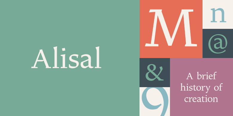
Alisal™
英文名字:zhuan_AlisalPro-Regular.TTF
字體介紹
Alisal™
品牌:Monotype
設計師:Carter,Matthew
發行時間:2008
字庫編碼:Unicode
分類:襯線體
字體屬性:
Matthew Carter說,他一直在完善Alisal的設計,以至於當他被要求來完成Monotype Library的設計時,感覺就像是在對自己的字體進行歷史性的復刻一樣。這種感覺甚至延伸到他的工作過程中的變化:盡管他現在已經在屏幕上完成瞭所有初始版本和最終版本的繪制,但Alisal的第一個試用版效果圖是用鉛筆完成的。
Alisal最適合歸類為意大利老式設計。真正的意大利老式風格最早出現於15世紀末至16世紀中期的意大利北部,是最早的羅馬風格。它們往往是襯線字體中最具書法特色的,其彎曲筆畫的軸線向左傾斜,像是用平頭的筆或筆刷繪制的一樣。這些設計具有堅固、流暢且明顯彎曲的襯線,下伸部較短且筆畫粗細對比適中。
Alisal幾乎擁有所有經典的意大利老式風格特征,再加上自己的一些怪異的特點。它本質上是書法的,比諸如Palatino或Goudy Old Style之類的字體更像是鋼筆繪制的。它比Goudy的Kennerley或Benton的Cloister更粗糙,而且字重通常比其他大多數意大利老式設計要粗。Alisal與傳統的老式設計完全不同的地方是襯線。雖然粗狂且清晰地反映瞭鋼筆繪制筆畫,但Alisal的襯線沒有彎曲,並且看起來像是直筆畫相交於垂直主筆畫。
與Caslon或Trajanus一樣,當把Alisal看作是一件復制品時,它是一個漂亮的設計。上伸部既高大又優雅,可以與其餘設計相提並論。 Alisal是一個包含羅馬體和粗體的小型傢族,還有一個基本羅馬字重的補充斜體,提供瞭大多數文本排版所需的全部內容。
Alisal並不像Carter的其他字體那樣廣為人知,但這個可愛且醞釀已久的設計絕對值得期待。
Matthew Carter has been refining his design for Alisal for so long, he says, that when he was asked to complete the design for the Monotype Library, it was almost as if he were doing a historical revival of his own typeface. The illusion even extended to changes in his work process: although he now does all his preliminary and final drawing on screen, the first trial renderings of Alisal were done as pencil renderings.
Alisal is best classified as an Italian old style design. Originally created between the late 15th and mid-16th centuries in northern Italy, the true Italian old styles were some of the first roman types. They tend to be the most calligraphic of serifed faces, with the axis of their curved strokes inclined to the left, as if drawn with a flat-tipped pen or brush. These designs offer sturdy, free-flowing and heavily bracketed serifs, short descenders, and a modest contrast in stroke weight.
Alisal has nearly all the classic Italian old style character traits, plus a few quirks of its own. It is calligraphic in nature, with more of a pen-drawn quality than faces like Palatino or Goudy Old Style. It is more rough-hewn than either Goudy’s Kennerley or Benton’s Cloister, and is generally heavier in weight than most of the other Italian old style designs. One place where Alisal makes a clean break with traditional old style designs is in the serifs. While sturdy and clearly reflecting pen-drawn strokes, Alisal’s serifs have no bracketing and appear to be straight strokes crossing the main vertical.
Like Caslon or Trajanus, Alisal is a handsome design when viewed as a block of copy. Ascenders are tall and elegant, and serve as a counterpoint to the robust strength of the rest of the design. Alisal is available as a small family of roman and bold with a complementary italic for the basic roman weight, providing all that is needed for the majority of text typography.
Alisal is not as well-known as some of Carter’s other typefaces, but this lovely and long-incubated design was certainly worth the wait.
字體圖片