- MD5值:
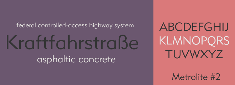
Metrolite® #2
英文名字:Metrolite2Com.TTF
字體介紹
Metrolite® #2
品牌:Linotype(Monotype)
設計師:Dwiggins,William A.
發行時間:2018
字庫編碼:Unicode
分類:無襯線體、正文字體
字體屬性:
美國平面設計師William Addison Dwiggins(簡稱W.A.D.)的第一種字體是Metro傢族,它是從1927年開始設計的。這個項目源於Dwiggins對當時新的歐洲無襯線字體的不滿,比如Futura, Erbar和Kabel,他在《Layout in Advertising》這一具有重大影響的書籍中表述過這種感覺。在Mergenthaler Linotype的敦促下,Dwiggins提出瞭解決該問題的方案,並開始瞭長達數十年的專業合作關系。
Metroblack是發佈的第一個Metro傢族字體,由Linotype於1929年推向市場(Metroblack#2™是Mergenthaler Linotype最終投入生產的兩個版本中的唯一一個提供數字版本的字體)。充斥著比當時歐洲流行的幾何風格更多的人文主義特征,Dwiggins畫出瞭他認為用於標題和廣告文案最理想的無襯線字體。比起現代派的成就,Metroblack的特征更加溫暖,這種字體都是中規中矩的曲線以及成角度的尾端(Metroblack還具有出奇漂亮的Q)。
Metro傢族的其他字重如Metromedium#2™和Metrolite#2™,是在Dwiggins的監督下由Mergenthaler Linotype的設計工作室設計。
盡管Metro傢族字體是創建於四分之三個世紀以前,算是歷史悠久瞭,但仍然是很受歡迎的無襯線字體傢族。2012年,Monotype設計師Toshi Omagari基於Dwiggins設計創作瞭一個具有26種不同字重的Metro Nova字體傢族。
American graphic designer William Addison Dwiggins’ (W.A.D. for short) first typefaces were the Metro family, designed from 1927 onward. The project grew out of Dwiggins’ dissatisfaction with the new European sans serif typefaces of the day, such as Futura, Erbar, and Kabel, a feeling he expressed in his seminal book Layout in Advertising. Urged by Mergenthaler Linotype to create a solution for the problem, Dwiggins began a professional relationship that would span over the next few decades.
The first Metro family typeface to be released was Metroblack, brought to market by Linotype in 1929 (Metroblack #2™ the only one of the two versions that Mergenthaler Linotype eventually put into production which is available in digital form). With more of a humanist quality than the geometric styles popular in Europe at the time, Dwiggins drew what he believed to be the ideal sans serif for headlines and advertising copy. Metroblack has a warmer character than the Modernists’ achievements, and the type is full of mannered curves and angled terminals (Metroblack also has an astoundingly beautiful Q).
The other weights of the Metro family, Metromedium #2™ and Metrolite #2™, were designed by Mergenthaler Linotype’s design office under Dwiggins’ supervision.
Despite having been created more than three-quarters of a century ago, the Metro family types have aged well, and remain a popular sans serif family. In 2012 the Metro Nova familiy was created in 26 different weights on the basis of Dwiggins designs by Monotype type designer Toshi Omagari.
字體圖片