- MD5值:
Fairbank™
英文名字:AM245___.TTF
字體介紹
Fairbank™
品牌:Monotype
設計師:Monotype; Fairbank,Alfred
發行時間:2018
字庫編碼:Unicode
分類:襯線體
字體屬性:
Monotype Bembo通常被認為是Aldus Manutius的15世紀羅馬風格中最漂亮的復刻版本之一,但最初版本沒有斜體。據說, Stanley Morison委托著名書法傢Alfred Fairbank為Bembo設計瞭第一個斜體,並於該1929年以金屬活字(metal font)發佈。但是,Alfred Fairbank聲稱自己是將設計作為一個獨立的項目繪制,然後把圖紙出售給瞭Monotype公司。據他所說,“有人說我是被邀請為Bembo羅馬體設計一款斜體。事實並非如此。如果已經有人提出要求,那麼制作的斜體字體則會有所不同。“
不管你相信哪個版本,很明顯,Fairbank的設計(雖然是無可否認的漂亮)顯然與Bembo羅馬體並不和諧。第二種更為傳統的斜體字最終被繪制出來並加入到Bembo傢族中。
Fairbank的第一個設計是基於16世紀書法大師Ludovico degli Arrighi的作品,它作為一種獨立的活字字體非常樸素。然而它從未涉足過凸版印刷字體(phototype),如果不是英國Monotype Imaging的排印負責人Robin Nicholas和美國Monotype Imaging的高級設計師Carl Crossgrove,這款字體很可能已經消失瞭。
Nicholas和Crossgrove使用Fairbank的原始圖紙作為新的數字設計的起點,但這僅僅是開始。他們改進瞭間距,對字距進行瞭精確的調整並優化瞭數字成像的設計。此外,Nicholas還創建瞭一組可替代的小寫字母、花式和斜體的大寫字母,以及足以使任何設計項目個性化的替代字符。
在完成工作時, Nicholas和Crossgrove創作瞭一個小型的字體傢族,其中包括Fairbank(早期活字字體的復刻版本)和Fairbank Chancery(一種更具書法意味的設計形式)。兩種字體都附加瞭一套華麗的大寫字母,優美的連字,開頭和結尾的字母,以及一組完整的小寫字母斜體字符。現在,Fairbank不再是失敗的Bembo斜體,而是有它自己的光芒:華麗、優雅的設計將為節日賀卡、邀請函,以及任何需要意大利風格美的應用增添一份優雅。”
Monotype Bembo is generally regarded as one of the most handsome revivals of Aldus Manutius’ 15th century roman type, but the original had no italic counterpart. The story is told that Stanley Morison commissioned Alfred Fairbank, a renowned calligrapher, to create the first italic for Bembo, which was released as metal fonts in 1929. Alfred Fairbank, however, claimed that he drew the design as an independent project and then sold his drawings to Monotype. According to him, the statement has been made that I was asked to design an italic for the Bembo roman. This is not so. Had the request been made, the italic type produced would have been different."
Whichever version you believe, it was obvious that Fairbank’s design – while undeniably beautiful – was not harmonious with Bembo roman. A second, more conventional italic was eventually drawn and added to the Bembo family.
Fairbank’s first design, which was based on the work of sixteenth-century writing master Ludovico degli Arrighi, managed to have a modest life of its own as a standalone font of metal type. It never made the leap into phototype fonts, however, and the face could have been lost, were it not for Robin Nicholas, Monotype Imaging’s Head of Typography in the United Kingdom, and Carl Crossgrove, a senior designer for Monotype Imaging in the US.
Nicholas and Crossgrove used the original drawings for Fairbank as the starting point for a new digital design, but this was only the beginning. They improved spacing, added subtle kerning and optimized the design for digital imaging. In addition, Nicholas created an alternative set of lowercase letters, fancy and swash capitals and enough alternate characters to personalize virtually any design project.
By the time his work was complete, Nicholas and Crossgrove had created a small type family that included Fairbank, a revived version of the earlier metal font, and Fairbank Chancery, a more calligraphic rendition of the design. An additional suite of ornate caps, elegant ligatures, and beginning and ending letters accompanies both fonts, as does a full complement of lowercase swash characters. Now, instead of a failed Bembo italic, Fairbank emerges in its true glory: a sumptuous, elegant design that will lend a note of grace to holiday greetings, invitations, and any application where its Italianate beauty is called for."
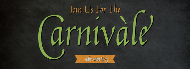
字體圖片