- MD5值:
ITC Avant Garde Gothic®
英文名字:ITCAvantGardeW1G-XLt.TTF
字體介紹
ITC Avant Garde Gothic®
品牌:ITC(Monotype)
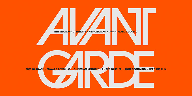
設計師:Lubalin,Herb; Carnase,Tom; Benguiat,Edward; Gürtler,André; Gschwind,Erich; Mengelt,Christian
發行時間:2016
字庫編碼:Unicode
分類:無襯線體
字體屬性:
ITC Avant Garde Gothic®由Herb Lubalin和Tom Carnase於1970年設計。該字體基於Lubalin為Avant Garde Magazine設計的logo——重疊且設置緊湊的幾何大寫字母的結合。ITC Avant Garde是一種幾何無襯線字體;也就是說其基本形狀是由圓形和直線構成,非常類似於20世紀20年代德國Bauhaus運動的作品。早期版本的ITC Avant Garde以其眾多獨特的替換字形和連字而聞名,這些字體仍然讓人想起20世紀70年代的排印風格。這些字體包含基本字母(不包含不常見的老式連字)。ITC Avant Garde仍然強健而現代,已成為當今平面設計師的必備品。大而開放的字懷、x字高較高使其看起來很友好,也使得該字體傢族更適用於短文和標題。窄體字重由Ed Benguiat於1974年繪制,斜體由André Gürtler、Erich Gschwind和Christian Mengelt於1977年設計。ITC Avant Garde® Mono是由Ned Bunnel於1983年完成的等寬版本。
ITC Avant Garde Gothic® was designed by Herb Lubalin and Tom Carnase in 1970. They based it on Lubalin´s logo for Avant Garde Magazine – an exciting construction of overlapping and tightly-set geometric capitals. ITC Avant Garde is a geometric sans serif; meaning the basic shapes are constructed from circles and straight lines, much like the work from the 1920s German Bauhaus movement. The early versions of ITC Avant Garde became well-known for their many unique alternates and ligatures that still conjure up the typographic aura of the 1970s. These fonts contain the basic alphabets (without the old unusual ligatures). Still strong and modern looking, ITC Avant Garde has become a solid staple in the repertoire of today’s graphic designer. The large, open counters and tall x-heights seem friendly, and help to make this family work well for short texts and headlines. The condensed weights were drawn by Ed Benguiat in 1974, and the obliques were designed by André Gürtler, Erich Gschwind and Christian Mengelt in 1977. ITC Avant Garde® Mono is a monospaced version done by Ned Bunnel in 1983.
字體圖片