- MD5值:
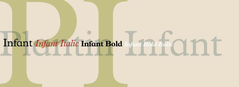
Plantin® Infant
英文名字:PlantinInfantMTStd.TTF
字體介紹
Plantin® Infant
品牌:Monotype
設計師:Pierpont,Frank Hinman
發行時間:2018
字庫編碼:Unicode
分類:
字體屬性:
Plantin是Monotype在1913年創作的一種文本字體傢族。與其同名者Christophe Plantin (荷蘭語為Christoffel Plantijn),1520年出生於法國。1549年,他搬到瞭安特衛普,位於現在的比利時。1555年,他在那裡開始印刷工作。他還曾在荷蘭萊頓大學(University of Leiden)短暫工作過。Christophe Plantin在書中所使用的字體對排印發展的未來起到瞭啟發作用。
1913年,英國Monotype公司的經理Frank Hinman Pierpont主導瞭對Plantin的復刻。根據位於安特衛普的Plantin-Moretus博物館中來自16世紀的樣本,特別是Robert Granjon的一款刻字和一款連筆意大利斜體, Plantin字體才被構思出來的。Plantin是為瞭用於國際出版市場的機械排字工作而繪制。
Plantin以及啟發它的歷史模型都是具有法國風格的老式字體,但是其x字高比Claude Garamond的作品要大。Plantin將繼續影響另一種Monotype的設計,Times New Roman。Stanley Morison和Victor Larent在造字時以Plantin作為參考。
和Garamond一樣,Plantin字體非常清晰可辨,給人一種經典優雅的感覺。Plantin確實是一款非常隨和的字體。字母的筆畫和襯線造型牢固,使字體的整體外觀比以往更強; 沒有細窄部分保證瞭其在銅版紙上的良好效果;另外,字母結構緊湊且不需要改變大小,使Plantin成為使用中最經濟的字體之一。簡而言之,它本質上是一款通用字體,非常適用於期刊或碎件印刷,且在許多書籍和雜志出版中非常有效。尤其對Plantin的粗體字重做瞭優化,以提供充分的對比:通過對襯線進行輕微的銳化來避免瞭笨重。
Plantin is a family of text typefaces created by Monotype in 1913. Their namesake, Christophe Plantin (Christoffel Plantijn in Dutch), was born in France during the year 1520. In 1549, he moved to Antwerp, located in present-day Belgium. There he began printing in 1555. For a brief time, he also worked at the University of Leiden, in the Netherlands. Typefaces used in Christophe Plantin’s books inspired future typographic developments.
In 1913, the English Monotype Corporation’s manager Frank Hinman Pierpont directed the Plantin revival. Based on 16th century specimens from the Plantin-Moretus Museum in Antwerp, specifically a type cut by Robert Granjon and a separate cursive Italic, the Plantin" typeface was conceived. Plantin was drawn for use in mechanical typesetting on the international publishing markets.
Plantin, and the historical models that inspired it, are old-style typefaces in the French manner, but with x-height that are larger than those found in Claude Garamond’s work. Plantin would go on to influence another Monotype design, Times New Roman. Stanley Morison and Victor Larent used Plantin as a reference during that typeface’s cutting.
Like Garamond, Plantin is exceptionally legible and makes a classic, elegant impression. Plantin is indeed a remarkably accommodating type face. The firm modelling of the strokes and the serifs in the letters make the mass appearance stronger than usual; the absence of thin elements ensures a good result on coated papers; and the compact structure of the letters, without loss of size makes Plantin one of the economical faces in use. In short, it is essentially an all-purpose face, excellent for periodical or jobbing work, and very effective in many sorts of book and magazine publishing. Plantin’s Bold weight was especially optimized to provide ample contrast: bulkiness was avoided by introducing a slight sharpening to the serifs’ forms."
字體圖片