- MD5值:
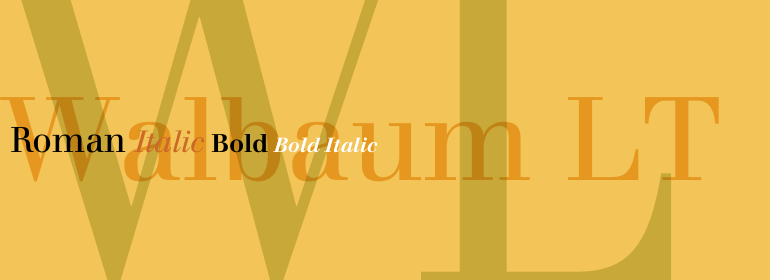
Walbaum LT
英文名字:WalbaumPro-Roman.TTF
字體介紹
Walbaum LT
品牌:Linotype(Monotype)
設計師:Walbaum,Justus Erich
發行時間:2018
字庫編碼:Unicode
分類:
字體屬性:
Walbaum最初是由Justus Erich Walbaum於1800年前後在Weimar制作的。它與Bodoni和Didot一起被評為歐洲最偉大的“現代”風格字體。現代風格字體標志著18世紀末和19世紀初排印發展到瞭鼎盛。它們的特征與之前的字體截然不同:如極端的垂直應力和精細的細線與大膽的主筆劃形成鮮明對比。
這款當代版本的Walbaum字體與J. E. Walbaum的原創版本非常接近,它與其他現代字體的不同之處在於它有更寬的大寫字母和更大的x字高。
個別字符也與其他現代字符完全不同,例如b沒有字腳襯線,小寫字母a的字懷近似方形,而大寫字母Q的小尾巴具有奇怪的非對稱接合點。
這款出色的字體傢族清晰易讀,靈活多變,在開放性和優雅性方面給人不可抗拒的溫暖。這可能是現代字體風格中最獨特的一款。
Walbaum was originally punchcut by Justus Erich Walbaum in Weimar around 1800. It ranks with Bodoni and Didot as one of the great European "modern" style typefaces. Modern types represented the ultimate typographic development of the late eighteenth and early nineteenth centuries. They have characteristics quite different from the types that preceded them; such as extreme vertical stress and fine hairlines contrasted by bold main strokes. This contemporary version of the Walbaum font is quite authentically close to J. E. Walbaum’s original, and it distinguishes itself from the other moderns with its wider caps and larger x-height. Some of the individual characters are quite different from other moderns as well, such as the b with no foot serif, the lowercase a with its squarish counter shape, and the Q tail with the curious asymmetric juncture. Possibly the most unique of the modern types, this beautiful family is legible, flexible, and has compelling warmth in its openness and grace."
字體圖片

