- MD5值:
Linotype Textra™
英文名字:TextraLTCom-Light.TTF
字體介紹
Linotype Textra™
品牌:Linotype(Monotype)
設計師:Schuss,Jochen; Herz,Jörg
發行時間:2018
字庫編碼:Unicode
分類:無襯線體
字體屬性:
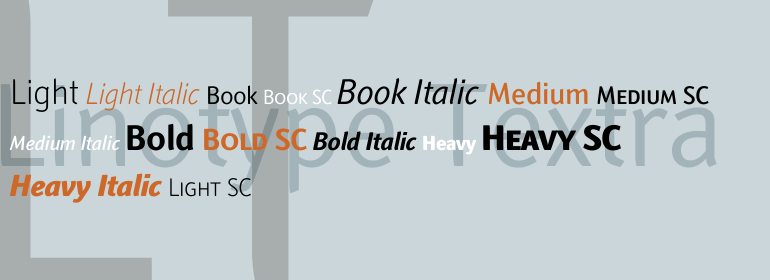
Linotype Textra™是對無襯線字體的一個巧妙轉變,由Jochen Schuss和Jorg Herz在2002年設計。Schuss是這樣說Linotype Textra的:二合一!同樣是Linotype Textra,它對於長篇文章來說是如此的中性和實用,但當它用於較大的點尺寸時,就變成瞭一種引人註目的標題字體。細節決定一切。字體清晰、健壯的形式使其在較小的文本字號中具有很高的可讀性。當使用在較大的尺寸,明顯的有角,稍微不規則的形式,使字體強大的特點變得明顯。所以才有瞭Linotype Textra這個名字: 具有15個字重的純文本,為平面設計師提供瞭幾乎任何字體工作的良好基礎。這五個常規的字重有匹配的真正的斜體和老式的數字,而這五個小型的字重包括等寬數字。”
Linotype Textra™ is a clever twist on the sans serif genre, designed by Jochen Schuss and Jörg Herz in 2002. Schuss says this about Linotype Textra: Two in one! The same Linotype Textra, which is so neutral and practical for long text passages turns into an eye-catching headline type when used in larger point sizes. The trick? It’s all in the details. The type’s clear, robust forms give it a high degree of legibility when used in smaller point sizes for texts. When used in larger sizes, the angular, slightly irregular forms that give the type its strong character become apparent. Hence the name Linotype Textra: pure text with a little something extra!" With 15 weights, the Linotype Textra family provides graphic designers with a good basis for almost any type of work. The five regular weights have matching true italics and old style figures, and the five small cap weights include tabular figures."
字體圖片