- MD5值:
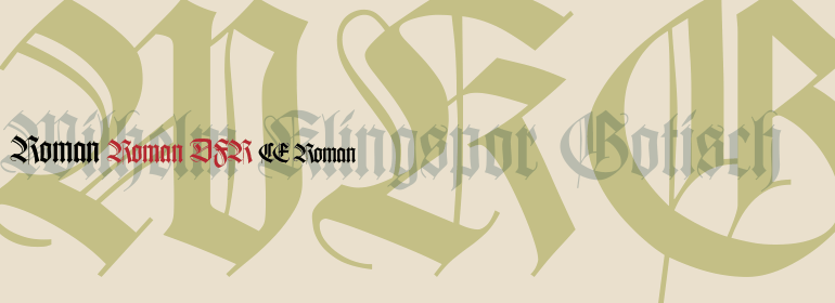
Wilhelm Klingspor Gotisch™
英文名字:WilhelmKlingsporGotischCom.TTF
字體介紹
Wilhelm Klingspor Gotisch™
品牌:Linotype(Monotype)
設計師:Koch,Rudolf
發行時間:2018
字庫編碼:Unicode
分類:哥特體
字體屬性:
Wilhelm Klingspor Gotisch™由Rudolf Koch於1925年為德國奧芬巴赫的Klingspor Bros. Foundry公司而設計。Koch是Klingspor的首席設計師,他以此鑄造廠的合夥人的名字命名該字體。Koch是一位傑出的書法傢、藝術傢和設計師。這款字體被世界各地的blackletter愛好者所推崇和模仿,它可能是現存的最好的textura字體示例。Textura(也稱為blackletter或gothic)是中世紀在北歐發展起來的一種書寫風格。Blackletter中使用的空格與我們所瞭解的羅馬字形大不相同。此類文字和字體中的小寫形式必須用黑白元素均勻地進行紋理處理,就像編織或織物的紋理一樣。哥特式大寫字母可以提供統一均勻的紋理(通過使用裝飾性的形式),或者如果它們是白色的且足夠寬,足夠開放,它們也可以提供產生視覺沖擊的亮點。Wilhelm Klingspor Gotisch的大小寫字母都很帥氣、充滿活力且有派頭,間距幾乎和Gutenberg的一樣好。這款閃閃發光的哥特式字體在大小為14pt或更大時最適合用於聖誕節問候、證書、婚禮請柬、廣告或音樂附屬品。
Wilhelm Klingspor Gotisch™ was designed in 1925 by Rudolf Koch for the Klingspor Bros. Foundry in Offenbach, Germany. Koch, who was chief designer at Klingspor, named the font in honor of the foundry’s co-owner. Koch was a remarkable calligrapher, artist, and designer. This face, admired and emulated by blackletter aficionados around the world, is probably the finest existing example of a textura typeface. Textura (also known as blackletter or gothic) is the style of writing developed in Northern Europe in the middle ages. The use of space in blackletter is quite different from what we know about Roman letterforms. The lowercase forms in such writing and typefaces must be evenly textured with black and white elements, like the texture of weaving or fabric. Gothic capital letters can provide either an integration of the even texture (by the use of ornamental forms) or, if they are wide and open and filled with white, they provide bright spots of visual emphasis. Both the caps and the lowercase in Wilhelm Klingspor Gotisch are handsome, vigorous, and masterful; and the spacing is almost as good as Gutenberg’s. Use this sparkling gothic gem in sizes 14 point or larger for Christmas greetings, certificates, wedding invitations, advertising, or music collateral pieces.
字體圖片

