- MD5值:
Neue Haas Grotesk™ Display
英文名字:NHaasGroteskDSPro-15UltTh.TTF
字體介紹
Neue Haas Grotesk™ Display
品牌:Linotype(Monotype)
設計師:Schwartz,Christian
發行時間:2015
字庫編碼:Unicode
分類:
字體屬性:
最初的金屬活字Neue Haas Grotesk™於20世紀50年代末將變成Helvetica®。但是,隨著時間的推移,Helvetica會遠離它的根源。一些使Neue Haas Grotesk™如此優秀的特征,由於技術變革帶來的壓力而被刪除或修改瞭。Christian Schwartz表示,Neue Haas Grotesk™最初是手工制作的,尺寸從5到72不等,但數字化的字體Helvetica一直都是通用一個尺寸。”可以這麼說,Schwartz對字體的數字化復興開創瞭歷史先河。在Neue Haas Grotesk™向今天數字化的Helvetica過渡的過程中所失去的東西,已經在這次數字化復興中得到瞭恢復。
Helvetica的常規體和粗體是為瞭Linotype的機器而被重新設計的;當Helvetica被用於照排時,這些變化仍然存在。在20世紀80年代,這個傢族被重新繪制並以Neue Helvetica的名字發行。Schwartz對原始Helvetica的復刻,他的新的Neue Haas Grotesk,配備瞭很多Max Miedinger的替換字形,這其中包括一個平腿的R。
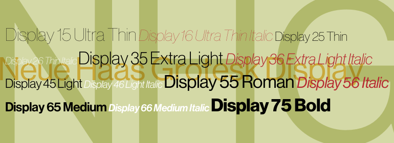
從Thin到Black 的8個顯示字重,再加上另外3個專門為文本繪制的字重,使這不僅僅是一次復興——它是一個多才多藝的、繪制精良的作品。Thin字重(最初是由彭博商業周刊要求的)的確很好也很細,顯露出瞭這些標志性字型的真正骨架。
作為一個OpenType字體傢族,Neue Haas Grotesk支持大多數中歐和許多東歐語言,並具有非常大的字符集。
The original metal Neue Haas Grotesk™ would, in the late 1950s become Helvetica®. But, over the years, Helvetica would move away from its roots. Some of the features that made Neue Haas Grotesk so good were expunged or altered owing to comprimises dictated by technological changes. Christian Schwartz says Neue Haas Grotesk was originally produced for typesetting by hand in a range of sizes from 5 to 72 points, but digital Helvetica has always been one-size-fits-all, which leads to unfortunate compromises."""" Schwartz’s digital revival sets the record straight, so to speak. What was lost in Neue Haas Grotesk’s transition to the digital Helvetica of today, has been resurrected in this faithful digital revival.
The Regular and Bold weights of Helvetica were redesigned for the Linotype machine; those alterations remained when Helvetica was adapted for phototypesetting. During the 1980s, the family was redrawn and released as Neue Helvetica. Schwartz’s revival of the original Helvetica, his new Neue Haas Grotesk, comes complete with a number of Max Miedinger’s alternates, including a flat-legged R.
Eight display weights, from Thin to Black, plus a further three weights drawn specifically for text make this much more than a revival – it’s a versatile, well-drawn grot with all the right ingredients. The Thin weight (originally requested by Bloomberg Businessweek) is very fine, very thin indeed, and reveals the true skeleton of these iconic letterforms.
Available as a family of OpenType fonts with a very large Pro character set, Neue Haas Grotesk supports most Central European and many Eastern European languages.
字體圖片