- MD5值:
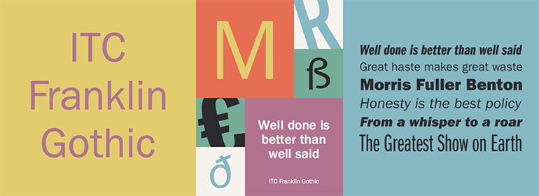
ITC Franklin Gothic™
英文名字:FranklinGothicLTPro-Md.TTF
字體介紹
ITC Franklin Gothic™
品牌:ITC(Monotype)
設計師:Caruso,Victor
發行時間:2014
字庫編碼:Unicode
分類:無襯線體
字體屬性:
Morris Fuller Benton於1903年至1912年為American Type Founders Company設計瞭Franklin Gothic。
正如早期無襯線字體在英國被稱為“grotesque”、在德國被稱為“grotesk”,他們在美國被稱為“gothic”。到20世紀初,北美也已經有很多“gothic”字體,但Benton的設計可能受到瞭德國流行的“grotesk”字體的影響,比如Basic Commercial,或者D. Stempel AG’s Reform。Franklin Gothic可能是以Benjamin Franklin的名字命名的; 然而,這個設計與那位美國早期著名的印刷商和政治傢沒有任何歷史關系。Benton是一位多產的設計師,他還設計瞭其他幾種無襯線字體,包括Alternate Gothic, Lightline Gothic 以及 News Gothic。事實上,News Gothic和Lightline Gothic可以看作是Franklin Gothic較細的版本,並且可以在設計中一起使用。
ITC Franklin Gothic是一套以Benton作品為基礎的大型字體,由兩位技藝精湛的工匠復刻擴展而成。1980年,Victor Caruso重新繪制瞭Franklin Gothic的原作,並設計瞭幾個新的字重。1991年,David Berlow添加瞭幾個窄體字重。這個長期以來備受歡迎的字體,包含幾十個字重和風格,適合於從打印文件的窄角到強大的網站任何場景。
Franklin Gothic的特征包括設計為兩層的字母 “a”和 “g”,微妙的筆劃對比,而且當圓潤的筆畫並入字幹時變細。整體上,這款字體顯得黑而單調,給人一種強烈的現代感。Franklin Gothic至今仍是使用最廣泛的無襯線體之一; 是報紙、廣告、海報的理想之選。
另一個類似設計的傢族是Trade Gothicand以及由David Berlow最新發佈的ITC Franklin.
Morris Fuller Benton designed Franklin Gothic for the American Type Founders Company in 1903-1912.
Just as early types without serifs were known by the misnomer grotesque"""" in Britain, and """"grotesk"""" in Germany, they came to be described as """"gothic"""" in America. There were already many """"gothic"""" typefaces in North America by the early 1900s, but Benton’s design was probably influenced by popular """"grotesks"""" from Germany, like Basic Commercial, or D. Stempel AG’s Reform. Franklin Gothic may have been named for Benjamin Franklin; however, the design has no historical relationship to that famous early American printer and statesman. Benton was a prolific designer, and he designed several other sans serif fonts, including Alternate Gothic, Lightline Gothic and News Gothic. In fact, News Gothic and Lightline Gothic could be seen as lighter """"versions"""" of Franklin Gothic, and may be used together in the right design.
ITC Franklin Gothic is a large set of fonts based on Benton’s work, with two skilled artisans behind the revival and expansion. In 1980, Victor Caruso re-drew the original Franklin Gothic and designed several more weights, and in 1991, David Berlow added several condensed and compressed weights. With dozens of weights and styles, this perennial favorite is ready for duty in any situation from tight corners on printed documents to powerhouse arenas on websites.
Recognizable aspects of Franklin Gothic include the two-story """"a"""" and """"g,"""" subtle stroke contrast, and the thinning of round strokes as they merge into stems. The type appears dark and monotone overall, giving it a robustly modern look. Franklin Gothic is still one of the most widely used sans serifs; it’s a suitable choice for newspapers, advertising and posters.
Another family with a similarly useful design is Trade Gothicand the new released ITC Franklin from David Berlow..
字體圖片