- MD5值:
Versailles™
英文名字:VersaillesLTCom-Light.TTF
字體介紹
Versailles™
品牌:Linotype(Monotype)
設計師:Frutiger,Adrian
發行時間:2018
字庫編碼:Unicode
分類:襯線體
字體屬性:
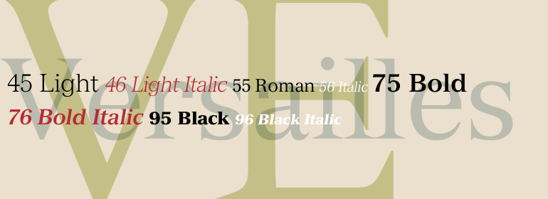
Versailles™是Adrian Frutiger於1984年為Linotype設計的。他是受1861年建造的巴黎歌劇院的設計師Charles Garnier紀念碑上的金屬刻字的影響。這種字體被稱為法文拉丁,特點是三角形襯線非常尖銳。Versailles字體讓人想起那個時代和地方:它有一個對稱且幾乎垂直的軸;x字高很高,且襯線尖銳。這種銳度與新巴洛克風格的元素形成瞭鮮明對比,比如a、f、g、j和y上扁平但彎曲的懸垂。Versailles非常適合用於較短文本和標題。當使用大尺寸或較粗字重時,它可用於歌劇海報、網站以及廣告橫幅。
Adrian Frutiger designed Versailles™ for Linotype in 1984. He was influenced by lettering cut in metal on a memorial for Charles Garnier, the designer of the Paris Opera building in 1861. This style of lettering, called French Latine, is characterized by very sharp triangular serifs. The Versailles typeface evokes that time and place: it has a symmetrical, almost vertical axis; a tall x-height, and serifs so sharp they could draw blood. This sharpness contrasts nicely with neo-baroque elements such as the flat-but-curvy overhangs on the a, f, g, j and y. Versailles is perfect for shorter texts and titles or headlines. When used in large sizes or in the bolder weights, it has an astonishing impact. Let it perform on opera posters, websites and advertising banners.
字體圖片