- MD5值:
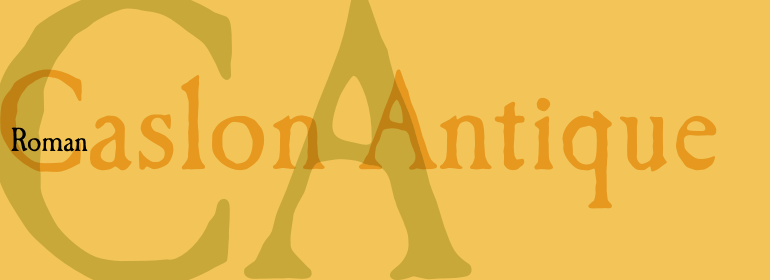
Caslon™ Antique
英文名字:LT_55840.TTF
字體介紹
Caslon™ Antique
品牌:Linotype(Monotype)
設計師:Nadall,Berne
發行時間:2018
字庫編碼:Unicode
分類:襯線體
字體屬性:
從1720年到1766年去世,英國人William Caslon沖擊瞭許多羅馬、斜體及非拉丁字體。當時大多數字體都是從荷蘭進口到英國的,因此Caslon受到荷蘭字體特征的影響。然而,他確實有一定的工藝水平,使他成為第一位偉大的英國雕刻師。
Caslon羅馬體變得如此受歡迎,它被稱為手寫體之王,在大洋的另一邊,美國人在1776年的《獨立宣言》中使用瞭它。
Caslon的字體在印刷商與字體界中享有傳奇地位,被認為是安全、牢靠和妥當的。
Caslon Antique由Berne Nadall設計,於1896年至1898年由美國字型廠商Barnhart Bros&Spindler推出。它與Caslon沒有任何相似之處,但具有人們想像中的十八世紀字體的那種古樸粗糙的風格。在平面設計中使用Caslon Antique來實現那種懷舊的效果。大尺寸顯示的標題或大寫字母縮寫看起來效果最好。
Caslon Black是於20世紀90年代由David Farey設計的,由一個相對細窄且非常粗的字重組成。它專門用於標題。 Caslon Black在其形狀的陰影中隱藏著一絲原創Caslon的痕跡,但卻有它自己強烈的表達方式。
Caslon Graphique由Leslie Usherwood於20世紀80年代設計。風格基本接近原創Caslon,但是這個版本字形寬厚,超細的細筆劃與很粗的主筆劃之間具有強烈的對比。這款精確繪制且風格化的Caslon有一種魄力; 它非常適合大尺寸顯示的標題或大寫字母縮寫。
The Englishman William Caslon punchcut many roman, italic, and non-Latin typefaces from 1720 until his death in 1766. At that time most types were being imported to England from Dutch sources, so Caslon was influenced by the characteristics of Dutch types. He did, however, achieve a level of craft that enabled his recognition as the first great English punchcutter. Caslon’s roman became so popular that it was known as the script of kings, although on the other side of the political spectrum (and the ocean), the Americans used it for their Declaration of Independence in 1776. The original Caslon specimen sheets and punches have long provided a fertile source for the range of types bearing his name. Identifying characteristics of most Caslons include a cap A with a scooped-out apex; a cap C with two full serifs; and in the italic, a swashed lowercase v and w. Caslon’s types have achieved legendary status among printers and typographers, and are considered safe, solid, and dependable.
Caslon Antique was designed by Berne Nadall and brought out by the American type foundry Barnhart Bros & Spindler in 1896 to 1898. It doesn’t bear any resemblance to Caslon, but has the quaint crudeness of what people imagine type looked like in the eighteenth century. Use Caslon Antique for that old-timey" effect in graphic designs. It looks best in large sizes for titles or initials.
Caslon Black was designed by David Farey in the 1990s, and consists of one relatively narrow and very black weight. It is intended exclusively for titles or headlines. Caslon Black has a hint of the original Caslon lurking in the shadows of its shapes, but has taken on its own robust expression.
Caslon Graphique was designed by Leslie Usherwood in the 1980s. The basic forms are close to the original Caslon, but this version has wide heavy forms with very high contrast between the hairline thin strokes and the fat main strokes. This precisely drawn and stylized Caslon has verve; it’s ideal for headlines or initials in large sizes."
字體圖片