- MD5值:
ITC CuppaJoe
英文名字:Cuppji__.TTF
字體介紹
ITC CuppaJoe
品牌:ITC(Monotype)
設計師:Curtis,Nick
發行時間:2018
字庫編碼:Unicode
分類:
字體屬性:
Nick Curtis對印刷術的熱愛始於他剛過青春期時,在東達拉斯的一條小巷。在一次例行巡邏中,他偶然發現瞭一個字體樣本目錄:一個寬大的綠色活頁夾,上面顯示瞭數百種字體!他被迷住瞭。Curtis的職業生涯使他從生產藝術到平面設計再到藝術指導,但字體始終是他對平面設計保持的熱情,尤其是從19世紀末到20世紀初產生的那些具有啟發性的設計。
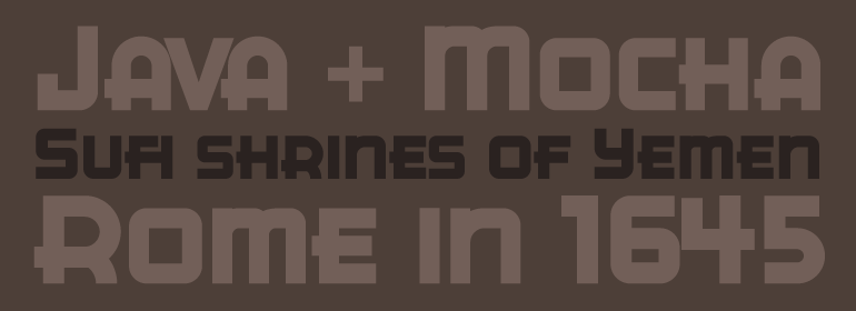
Curtis對ITC CuppaJoe的靈感來自裝飾藝術字體,但並非典型的來源。根據您的年齡或您對20世紀初包裝設計的興趣,ITC CuppaJoe可能會讓您覺得看起來很熟悉。它是基於20世紀30年代A& P高級咖啡Bokar的商標藝術。Curtis基於最初咖啡罐上字體的柔和曲線以及粗而尖的筆畫,來打造一款引人註目的獨特字體。濃鬱、醇厚、令人滿足——這就是ITC CuppaJoe!
Nick Curtis’s love affair with typography began when he was barely past adolescence, in a neighborhood alley of East Dallas. On a routine patrol for tossed treasures, he came across a type specimen catalog: a big, fat green binder displaying hundreds of fonts! He was hooked. Curtis’s career has taken him from production art to graphic design to art direction, but type has always remained his graphic passion, especially the provocative designs produced from the late 19th through the early 20th centuries.
Curtis’s inspiration for ITC CuppaJoe comes from Art Deco lettering, but not from the typical sources. Depending upon your age or your interest in early twentieth-century package design ITC CuppaJoe might look familiar. Its foundation is the label art for Bokar, A&P’s premium coffee during the 1930s. Curtis built on the gently sweeping curves and bold angular strokes of the original coffee-can lettering to create a distinctive typeface that commands attention. Rich, full-bodied, satisfying – now that’s a ITC CuppaJoe!
字體圖片