- MD5值:
Galien
英文名字:Galien-Light.TTF
字體介紹
Galien
品牌:Black[Foundry]
設計師:Black[Team]
發行時間:2018
字庫編碼:Unicode
分類:無襯線體
字體屬性:
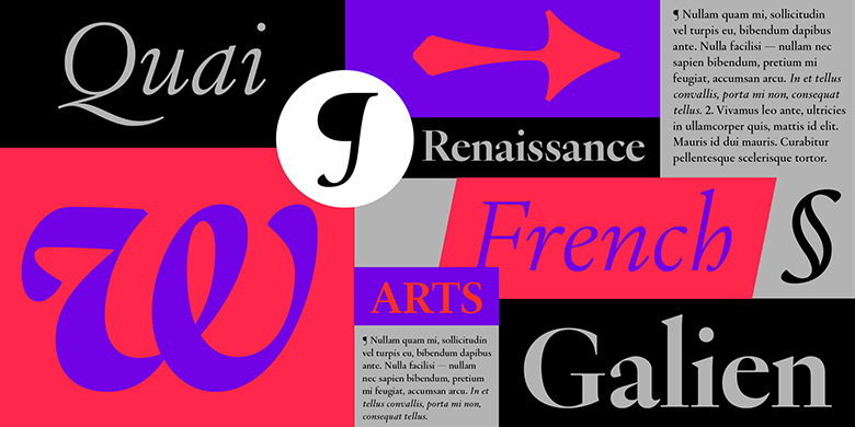
Galien是一種現代襯線字體,其靈感來自於15世紀開始並持續瞭一百多年的法國文藝復興時期的字體。這是古希臘和羅馬科學,藝術和文學的重塑時代。主流印刷術從印刷初期的原始Textura Blackletter模型轉變為受加洛林式書寫啟發的人文字母形式,該字體在聖羅馬帝國的古代手稿中使用。這是迄今為止影響我們閱讀習慣的拉丁字體的一個決定性轉折點,這裡對詹森,馬尼蒂烏斯,格裡菲,加拉蒙德,格蘭洪,霍金,維利爾等當代大師的打孔器的工作進行瞭總結,並翻譯成二十世紀的數字字體Galien。 Galien並不是某個特定字體的復興,而是一個時期的復興。斜體字直接受到16世紀初期的威尼斯風格的啟發。加利安(Galien)是各種舊樣式模型的正確混合形式,塑造瞭當代的數字字體。調整後的尺寸可以很好地適應正文副本的大小,厚薄之間的對比仍然很明顯,可以保持優雅。該系列的8種樣式確保瞭小尺寸的可讀性,而特殊的Poster剪裁則在更過渡的軸上具有特別高的對比度,並通過一些大膽的設計決策來影響標題,從而增強瞭這種解釋的炫目性。為瞭實現當代使用,Galien的字符集非常全面,並包含瞭文藝復興時期字體中不存在的字形:多組數字,小數,多種貨幣…等。這種設計的特殊性可能是特別是在斜體的波動角度中找到,使它具有人文主義的活力和溫暖的感覺。羅馬人的特點是略微的切口和曲線折斷,使其更具決定性,並且與更加流暢和柔和的斜體字搭配得很好。讀音符號和變音符號又細又高,讓人聯想到文藝復興時期的字母的精致復雜性,並為歐洲語言創造瞭獨特的對比。對於時尚和美容,藝術和文化,教育,設計和建築項目而言,它將是一個完美的字體傢族,並將在雜志,報紙和在線出版物中很好地發揮作用。
Galien is a modern serif typeface inspired by the typography of the French Renaissance that started in the 15th century and lasted for more than a hundred years. These were the times of the reinvention of the Ancient Greek and Roman science, art and literature. Mainstream typography moved away from the original Textura Blackletter model of the early days of printing to Humanist letterforms inspired by Carolingian writing used in ancient manuscripts of the Holy Roman Empire. It was a decisive turning point for Latin typography that shapes our reading habits up to this day.The work of the punch-cutters such as Jenson, Manitius, Griffo, Garamond, Granjon, Haultin, Villiers and other contemporary masters is here summarized, abstracted, and interpreted into Galien, a digital typeface of the twentyfirst century. Galien is rather a revival of a period than that of a particular typeface. The Italics are directly inspired by the Venitian types of the early sixteenth century.Galien is a well-dosed blend of various Old Style models that shapes a contemporary digital typeface. Tuned to perform well at body copy size, the contrast between thick and thin remains nevertheless quite visible to preserve elegance. While the 8 styles of the family ensure good legibility at small sizes, the special Poster cut enhances the flamboyance of this interpretation with a particularly high contrast on a more transitional axis with some daring design decisions for impactful headlines. To enable contemporary usage, Galien’s character set is quite comprehensive and includes glyphs that did not exist in the typefaces of the Renaissance period: multiple sets of numerals, fractions, a large selection of currencies… etc.The particularities of this design may be notably found in the fluctuating angles of the Italics giving it a Humanist vibrance and a warm feel. The Romans feature slight cuts and curve breaks making it more decisive and pairing well with the more flowing and soft Italics. Accents and diacritics are thin and tall, reminiscent of the delicate sophistication of the Renaissance letters as well as creating a unique contrast for European languages.Galien will be the typeface of choice for setting highly readable texts as well as beautiful titles in projects where elegance and style are a must. It will be a perfect font family for fashion and beauty, arts and culture, education, design and architectural projects and will work well in magazines, newspapers and online publications.
字體圖片