- MD5值:
Serpentine™
英文名字:SerpentineICG-Light.TTF
字體介紹
Serpentine™
品牌:Linotype(Monotype)
設計師:Jensen,Dick
發行時間:2018
字庫編碼:Unicode
分類:無襯線體
字體屬性:
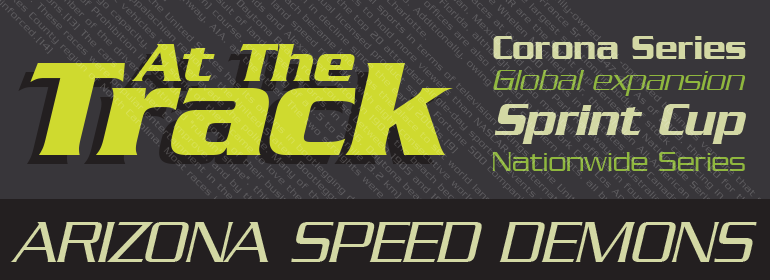
Dick Jensen (USA) designed Serpentine, is a contemporary-looking display font, for the Visual Graphics Corporation in 1972. With the rise of digital typesetting and desktop publishing, this typeface quickly became both popular and ubiquitous. This dynamic, wide, boxy design is identifiable via tiny triangular swellings at the stroke endings – what might be called semi-serifs. Serpentine is available in six different font styles: Light, Light Oblique, Medium, Medium Oblique, Bold, and Bold Oblique.
Serpentine” is a greenish rock that sometimes resembles a serpent’s skin, and is often used as a decorative stone in architecture. Though this font doesn’t seem at all snaky or sinuous, it does have an architectural, stone-like solidity. The subtle, almost non-existent curves and semi-serifs keep it from being too stern or cold. Although the underlying strokes of each weight are similar, the six members of the Serpentine font family all present their own individual personalities. Serpentine Light lends itself well to text for onscreen displays, for instance, while the numbers from typeface’s heavier weights are seen around the world on soccer jerseys! Additionally, the oblique styles convey a streamlined sense of speed, furthermore lending Serpentine well to sport and athletic applications (especially the faster, high-speed varieties).
Because of its 1970s pedigree, Serpentine has come to be known as a genuine “retro” face. This makes the typeface even more appropriate for display usage, in applications such as logo design, magazine headlines, and party flyers.
If you like Serpentine, check out the following similar fonts in the Linotype portfolio:
Copperplate Gothic (similar serifs)
Eurostile (similar width)
Princetown (another “athletic” font)
Insignia (similar “techno” feeling)”
字體圖片