- MD5值:
ITC Officina® Serif
英文名字:OfficinaSerifITCPro-Book.TTF
字體介紹
ITC Officina® Serif
品牌:ITC(Monotype)
設計師:Spiekermann,Erik; Schäfer,Ole
發行時間:2018
字庫編碼:Unicode
分類:
字體屬性:
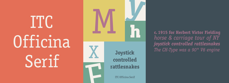
當ITC Officina於1990年首次發佈時,它是由襯線字體和無襯線字體組成的配對傢族。以兩個斜體字為字重,旨在作為商務信函的常用字體。但事實證明,這種字體在很多領域都比通信更受歡迎。ITC Officina的設計師Erik Spiekermann說:“一旦ITC Officina被潮流引領者用來表示‘酷’,它就失去瞭它的純真。再也不用假裝它隻需要兩個字重就能處理辦公室信件瞭。”作為雜志和廣告使用字體,它需要適當的標題字重以及在原始Book和Bold之間再增加一個字重。Spiekermann與MetaDesign的排印和字體設計總監Ole Schaefer共同合作來增添新的字重和小型大寫字母。現在,擴展後的ITC Officina傢族包括Medium、Extra Bold和Black三種字重以及與其匹配的斜體(無論是Sans還是Serif),還有新小型大寫字母字體的原始Book和Bold字重。
When ITC Officina was first released in 1990, as a paired family of serif and sans serif faces in two weights with italics, it was intended as a workhorse typeface for business correspondence. But the typeface proved popular in many more areas than correspondence. Erik Spiekermann, ITC Officina’s designer: Once ITC Officina got picked up by the trendsetters to denote ‘coolness,’ it had lost its innocence. No pretending anymore that it only needed two weights for office correspondence. As a face used in magazines and advertising, it needed proper headline weights and one more weight in between the original Book and Bold."" To add the new weights and small caps, Spiekermann collaborated with Ole Schaefer, director of typography and type design at MetaDesign. The extended ITC Officina family now includes Medium, Extra Bold, and Black weights with matching italics-all in both Sans and Serif — as well as new small caps fonts for the original Book and Bold weights.
字體圖片