- MD5值:
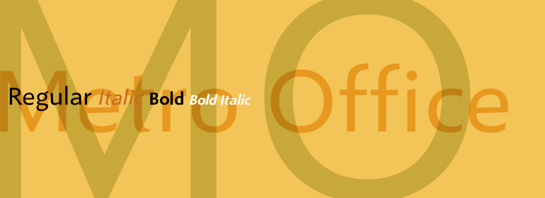
Metro® Office
英文名字:MetroOffice-Regular.TTF
字體介紹
Metro® Office
品牌:Linotype(Monotype)
設計師:Kobayashi,Akira
發行時間:2018
字庫編碼:Unicode
分類:無襯線體、正文字體
字體屬性:
每年,越來越多的文本都是直接在辦公應用的計算機屏幕上閱讀,或者從復印機或激光打印機打印出的紙張上閱讀。如今清晰、易讀的字體在辦公室通信中比以往任何時候都重要。然而,每個員工都希望在公司裡有一點個性。大多數辦公環境僅配備瞭幾種基本字體,這些字體經過優化可用於文本、激光打印機和屏幕上。
Linotype Office Alliance字體可確保數據清晰度。每個字體傢族的所有字體粗細都具有相同的字符尺寸;個別字母或單詞的樣式可以在不影響自動換行的情況下做改變!所有數字、數學符號和貨幣符號均為表格形式;它們具有相同的字符設置寬度,從而確保沒有什麼可以能妨礙圖形、圖表和表格設計的清晰。除瞭非常開放和清晰之外,該傢族字體中的字符還具有相同的大寫字母高度和相同的x高度。Linotype Office Alliance字體適當地簡化瞭財務報告的制作和閱讀。
Neuzeit Office傢族是按照原始的無襯線傢族Neuzeit S的模型設計的,它是由D. Stempel AG和Linotype Design Studio於1966年生產。Neuzeit S本身是對D. Stempel AG的DIN Neuzeit的重新設計,由Wilhelm Pischner於1928年至1939年期間創作。
為瞭代表自己的時代,DIN Neuzeit一定能奏響和諧的樂章。DIN Neuzeit是一款建構的幾何無襯線字體。它誕生於20世紀20年代,這是一個設計試驗和標準化的時代,它的精神因包豪斯(Bauhaus)和德斯蒂吉爾(De Stijl)運動而聞名於藝術、建築和設計領域。
在20世紀60年代重新將其設計為Neuzeit S時,考慮瞭無襯線字母設計的其他發展。Neuzeit S的幾何感看起來不那麼明顯,反而更具哥特式或工業化的風格。它具有雙層的a,而不是不太清晰的單層變體,這使它與Futura之類的字體區別開來。與諸如Helvetica這種很受歡迎的怪誕無襯線字體不同,Neuzeit S尤其是經過重新設計的Neuzeit Office包含瞭更開放、清晰的字母。Neuzeit Office保留瞭多年來與其設計相關的典型數字形式。經過40年的發展,Neuzeit再次被重新設計,且現在比以往任何時候都新穎。
Linotype的字體設計主管Akira Kobayashi於2006年修訂並更新瞭Neuzeit Office。他最大的改變是改進瞭設計,使其在文本中的表現更加理想。此外,他還創作瞭其同伴斜體以強調文本。
Office Alliance系統中的其他三個傢族包括Metro Office,Times Europa Office和Trump Mediaeval Office。
Every year, more and more text is read directly on a computer screen in office applications, or from freshly printed sheets from a copier or laser printer. Clear, legible text faces are more imperative to office communication than ever before. Yet every worker desires a small bit of personality in the corporate world. Most office environments are only equipped with a few basic fonts that are truly optimized for use in text, with laser printers, and on screen.
The Linotype Office Alliance fonts guarantee data clarity. All of the font weights within the individual family have the same character measurements; individual letters or words may have their styles changed without line wrap being affected! All numbers, mathematical signs, and currency symbols are tabular; they share the same set character width, ensuring that nothing stands in the way of clear graph, chart, and table design. In addition to being extremely open and legible, the characters in this collection’s fonts also share the same capital letter height and the same x-height. The production and reading of financial reports is duly streamlined with the Linotype Office Alliance fonts.
The Metro Office family is designed after the model of the original sans serif family produced by W.A. Dwiggins and Mergenthaler Linotype’s design studio during the late 1920s and 1930s. A distinctly new interpretation of the sans serif idea, Metro was a thoroughly American" sans serif when it was released. However, over the ensuing decades, it became a favorite the world over. Moreover, it is one of the first "humanist" sans serif typefaces designed.
While redesigning Metro in 2006, Linotype’s Type Director Akira Kobayashi drew from his own knowledge of humanistic letterforms. The result is a redefined Metro; a typeface that is finally ready for heavy text setting. The original Linotype Metro never had italic variants. Kobayashi has created oblique variants, extending its use in document setting. A double-storey a and g, as well as a wider w were features of Dwiggins’ original Metro design that were filtered out by Mergenthaler Linotype in the 1930s. Kobayashi remedied this historical slight, retooling Dwiggins’ original forms and optimizing their legibility. Kobayashi has additionally retooled some of Metro’s more troublesome letters, which has black elements that became too dense. By opening up the troublesome joins (like that on the Q), Kobayashi has given his new Metro a more even color in text, improving its legibility while retaining its original spirit.
The other three families in the Office Alliance type system include Neuzeit Office, Times Europa Office, and Trump Mediaeval Office."
字體圖片