- MD5值:
Iridium®
英文名字:LT_54428.TTF
字體介紹
Iridium®
品牌:Linotype(Monotype)
設計師:Frutiger,Adrian
發行時間:2018
字庫編碼:Unicode
分類:襯線體、正文字體
字體屬性:
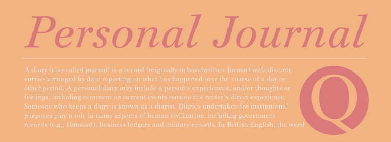
Iridium™由Adrian Frutiger於1972年為Linotype設計。它是現代風格的Bodoni或Didot,因為它是粗細對比度高和勻稱的字重分佈所創造的火花。但是,現代風格有時會顯得粗糙而僵硬,而Frutiger的優美詮釋則緩和瞭這一點。Iridium本身是一種非常堅硬、易碎且堅固的金屬;然而,這個詞的拉丁語和希臘語詞根是彩虹的意思。事實上,這種字體比一般的現代字體更有光澤和更有復雜的感覺——註意從腰部到襯線的細度,圓角漂亮的橢圓形,以及襯線的輕微托襯。Iridium最初是用於照排的,Frutiger本人用手親自切割。這個數字版本擁有原始版本的所有工藝,包括羅馬字體、真正的斜體和粗體。Iridium對於書籍、雜志文字和標題特別有用。”
Iridium™ was designed by Adrian Frutiger in 1972 for Linotype. It is in the modern" style like Bodoni or Didot, in that it has the sparkle created by a high thick/thin contrast and a symmetrical distribution of weight. But the sometimes harsh and rigid texture of the modern style is tempered by Frutiger’s graceful interpretation. Iridium itself is a very hard, brittle and strong metal; yet the Latin and Greek roots of the word mean rainbow, or iridescence. And indeed, this font is infused with a more lustrous and complex spirit than the average rather stark modern typeface – note the stems that gently taper from waist to serif, the nicely curved ovals of the round characters, and the slight bracketing of the serifs. Iridium was originally designed for phototypesetting, and Frutiger himself cut the final master photo-mask films by hand. This digital version has all the craftsmanship of that original and includes the roman, a true italic, and the bold weight. Iridium works particularly well for book and magazine text and headlines."
字體圖片

