- MD5值:
Givens Antiqua™
英文名字:GivensAntiquaPro.TTF
字體介紹
Givens Antiqua™
品牌:Monotype
設計師:Ryan,George
發行時間:2018
字庫編碼:Unicode
分類:
字體屬性:
Drawn by George Ryan and named after Robert Givens, the co-founder and first president of Monotype Imaging, the Givens Antiqua™ typeface speaks with elegance and subtle authority. The design’s open proportions, generous x-height and soft serifs lend Givens Antiqua a gracious quality that invites reading.
I didn’t work from any single design model,” Ryan recalls. “The face grew out of my experimenting with several characters from a hand-lettered headline in a magazine. I worked on the shapes and forms for some time before I put the drawings in a drawer.” At that point Ryan had finished the basic alphabet in two weights, but had not yet tackled the italics.
A new project came along that demanded his full attention, and it was two years before he revisited the drawings. He liked what he saw and decided to finish the job.
“The italics were the most problematic designs in the family,” says Ryan, “but once I had their basic shapes and proportions, the rest was basically a production project.” Another year of sketching, testing, editing and reworking characters ensued before Givens Antiqua was ready for release.
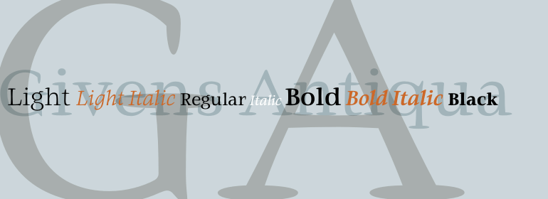
The result is a four-weight family of roman designs and small caps, with complementary italics for the lightest three weights and a suite of swash caps for the italic designs. Givens Antiqua and Givens Antiqua Light show a modest stroke weight stress and a light, even text color. Givens Antiqua Bold is an effective emphasizer for text copy and an authoritative communicator at display sizes. The Black weight performs best at large sizes and makes a powerful statement without shouting, while the italic swash capitals possess enough vitality to serve as standalone initial letters.”
字體圖片