- MD5值:
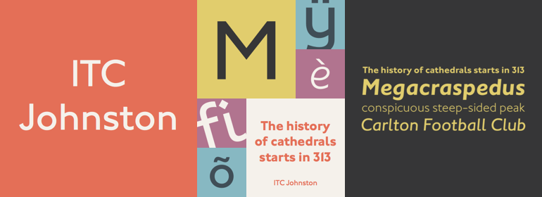
ITC Johnston™
英文名字:IT206___.TTF
字體介紹
ITC Johnston™
品牌:ITC(Monotype)
設計師:Dawson,Richard; Farey,Dave
發行時間:2018
字庫編碼:Unicode
分類:無襯線體
字體屬性:
ITC Johnston是Dave Farey和Richard Dawson在Edward Johnston作品的基礎上共同努力的結果。倫敦字體設計師Dave Farey說,在開發ITC Johnston時,他“不對字體和人都做瞭大量的調研。” Edward Johnston有點古怪,“以坐在躺椅上,口袋裡裝著吐司而著稱。”(那個躺椅是客廳中他最喜歡的傢具;吐司是為瞭讓他手邊總有吃的)。在那個世紀初期,Johnston幾乎一手促成瞭文藝復興時期英國宮廷斜體的書法傳統。他的著作《Writing & Illuminating, & Lettering》(書名中多出來一個獨特的逗號)是這方面的經典著作,他對同時代人的影響是巨大的。然而,他最令人難忘的也許是1916年為London Underground Railway(現在的London Transport)設計的字母系統,這是基於他最初的“block letter”模型。
Johnston的字母是根據他在大英博物館對歷史書寫技巧的研究而精心建構的。他的大寫字母取自最優秀的古典羅馬銘文。“他對無襯線字體樣式有著嚴格的規定”,Farey說,“特別是線條的粗細結構,高度與粗細的比例是1:7,因此水平線和垂直線的厚度是一樣的。Johnston的O、C和G,甚至是S的圓都是正圓。這對於文本大小來說是個問題,或者實際尺寸小於半英寸。它還排除瞭任何其他的字重,但中等粗細除外,以及任何比1:7的比例更細或者更粗的字重。“Johnston在他所進行的任何項目中都表現得很慢,這是眾所周知的。”,Farey說, “在抗議之下,他最終用瞭20年創作瞭一個較粗的字重(僅有大寫字母)。”
Farey和他的同事Richard Dawson將ITC Johnston建立在Edward Johnston的原始block letter的基礎之上,並將其擴展稱一個包含三種字重的字體傢族。據Farey所說,Johnston本人從未把他的Underground字體稱為字體。這是一個用於標識和其他顯示目的的字母系統,旨在使人們一目瞭然,而不僅僅是在文字段落中可讀。Farey和Dawson的改編版本保留瞭Johnston字母的鮮明風格,同時又很好地融入到瞭文本中。
Johnston的block letter與Gill Sans相似,後者是Monotype在20世紀20年代成發展起來的一個非常成功的字體傢族。年輕的Eric Gill曾在倫敦印刷學院師從Johnston,與他一起從事Underground項目,並遵循許多相同的原則開發瞭他自己的無襯線字體。自第一次世界大戰之後,Johnston字母使倫敦交通運輸系統有一種獨特的風格,但幾十年來,Gill Sans已經成為英國平面設計標志性的字母形式。(Johnston的無襯線字體一直用於Underground項目,直到20世紀80年代初,倫敦的設計公司Banks and Miles設計瞭一個x高度更高的修訂版和現代化版本。)
Farey和Dawson在他們位於倫敦的Clerkenwell的工作室工作,他們希望創作一個既不是博物館展品,也不是拙劣的字體傢族,這將為無處不在的Gill Sans提供“一種同流派的替代字體”。“這些字母”,Farey在談到Johnston字母時說:“從未發展成現代風格。”他和Dawson不僅設計瞭ITC Johnston的三種字重,還為每種字重都提供瞭一套完整的小型大寫字母(這是原始的Johnston字體和Gill字體都沒有的),還有老式數字和幾個替代字符。
ITC Johnston is the result of the combined talents of Dave Farey and Richard Dawson, based on the work of Edward Johnston. In developing ITC Johnston, says London type designer Dave Farey, he did “lots of research on not only the face but the man.” Edward Johnston was something of an eccentric, “famous for sitting in a deck chair and carrying toast in his pockets.” (The deck chair was his preferred furniture in his own living room; the toast was so that he’d always have sustenance near at hand.) Johnston was also almost single-handedly responsible, early in this century, for the revival in Britain of the Renaissance calligraphic tradition of the chancery italic. His book Writing & Illuminating, & Lettering (with its peculiar extraneous comma in the title) is a classic on its subject, and his influence on his contemporaries was tremendous. He is perhaps best remembered, however, for the alphabet that he designed in 1916 for the London Underground Railway (now London Transport), which was based on his original “block letter” model.
Johnston’s letters were constructed very carefully, based on his study of historical writing techniques at the British Museum. His capital letters took their form from the best classical Roman inscriptions. “He had serious rules for his sans serif style,” says Farey, “particularly the height-to-weight ratio of 1:7 for the construction of line weight, and therefore horizontals and verticals were to be the same thickness. Johnston’s O’s and C’s and G’s and even his S’s were constructions of perfect circles. This was a bit of a problem as far as text sizes were concerned, or in reality sizes smaller than half an inch. It also precluded any other weight but medium ‘ any weight lighter or heavier than his 1:7 relationship.” Johnston was famously slow at any project he undertook, says Farey. “He did eventually, under protest, create a bolder weight, in capitals only ‘ which took twenty years to complete.”
Farey and his colleague Richard Dawson have based ITC Johnston on Edward Johnston’s original block letters, expanding them into a three-weight type family. Johnston himself never called his Underground lettering a typeface, according to Farey. It was an alphabet meant for signage and other display purposes, designed to be legible at a glance rather than readable in passages of text. Farey and Dawson’s adaptation retains the sparkling starkness of Johnston’s letters while combining comfortably
字體圖片