- MD5值:
ITC Merss™
英文名字:MERSSITC.TTF
字體介紹
ITC Merss™
品牌:ITC(Monotype)
設計師:Manso,Eduardo
發行時間:2018
字庫編碼:Unicode
分類:
字體屬性:
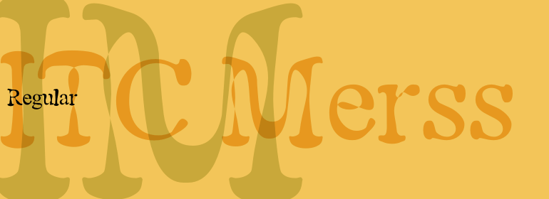
ITC Merss證明有時候意外也會有好的結果。一天晚上,阿根廷平面及字體設計師Eduardo Manso把咖啡灑到瞭辦公桌上。在收拾殘局的時候,他註意到其中一個水珠看起來像是羅馬字母“l”——帶有襯線。這激發瞭他的想象力。“如果一個完整的字母表也是按照這種不規則的流程設計出來的呢?ITC Merss是Manso對“流動的”字母形狀進行實驗的結果。這個奇特的設計看起來既古老又自然。其不規則的紋理令人驚嘆——是對字符形狀精心建模的結果。Manso想要保持液體灑落後的自由形式特征,他也知道單個字母必須在潛在的和諧下協同工作。當不嘗試字體或灑落的咖啡時,Manso會創造瞭屢獲殊榮的圖形和出版物設計。作為設計雜志《el Huevo》(the Egg)的撰稿人,他還撰寫有關字體和排印的文章,並且是該出版物設計團隊的一員。
ITC Merss proves that sometimes accidents work out just fine. Late one evening Eduardo Manso, an Argentinean graphic and type designer, spilled coffee on his desk. When he began to wipe up the mess, he noticed that one of the splashes looked like a roman letter ‘l’ – complete with serifs. This triggered his imagination. “What if a complete alphabet was created with this same irregular flow to the character designs?” ITC Merss was the result of Manso’s experiments with “fluid” letter shapes. The oddly handsome design looks aged and spontaneous at the same time. Its irregular texture is striking-the result of careful modeling of character shapes. While Manso wanted to maintain the free-form character of spilled liquid, he also knew the individual letters had to work together with an underlying harmony. When not experimenting with typefaces – or spilled coffee – Manso creates award-winning graphic and publication designs. A contributor to the design magazine el Huevo (the Egg), he also writes articles on type and typography and is part of the publication’s design team.
字體圖片

