- MD5值:
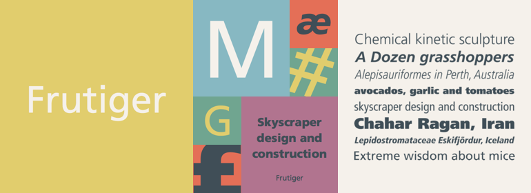
Frutiger®
英文名字:FrutigerLTPro-Light.TTF
字體介紹
Frutiger®
品牌:Linotype(Monotype)
設計師:Frutiger,Adrian
發行時間:2016
字庫編碼:Unicode
分類:
字體屬性:
1968年,Adrian Frutiger受委托為巴黎新戴高樂機場開發指示牌和導向系統。
盡管每個人都認為他想用他那成功的Univers字體傢族,但Frutiger決定制作一款新的無襯線字體,這種字體要適合機場導視牌特定的易讀性要求:駕駛和行走時,距離遠近及不同的角度都能被輕松識別。最終設計的字體符合現代建築風格的機場。
1976年,他與Linotype一起合作為D. Stempel AG擴展並完成瞭這一字體傢族,將其命名為Frutiger。
Frutiger™傢族在結構上既不是嚴格意義上的幾何體,也不是人文主義體;其字形是經過精心設計的,每個字符都能很容易被識別。該字體如此清晰使其非常適用於標牌和展示。雖然它最初是為大型機場而設計,但是整個字體傢族都有一種溫暖、精細的感覺,近年來,這種感覺使它更適用於雜志和小冊子中顯示較小的正文文本。
該傢族包含14種字重及14種伴生字體,都帶有中歐字符和重音符號。另外還有14種西裡爾文伴生字體。
另請參閱Linotype Platinum Collection中最新版修訂的版本Frutiger Next。
In 1968, Adrian Frutiger was commissioned to develop a sign and directional system for the new Charles de Gaulle Airport in Paris.
Though everyone thought he would want to use his successful Univers font family, Frutiger decided instead to make a new sans serif typeface that would be suitable for the specific legibility requirements of airport signage: easy recognition from the distances and angles of driving and walking. The resulting font was in accord with the modern architecture of the airport.
In 1976, he expanded and completed the family for D. Stempel AG in conjunction with Linotype, and it was named Frutiger.
The Frutiger™ family is neither strictly geometric nor humanistic in construction; its forms are designed so that each individual character is quickly and easily recognized. Such distinctness makes it good for signage and display work. Although it was originally intended for the large scale of an airport, the full family has a warmth and subtlety that have, in recent years, made it popular for the smaller scale of body text in magazines and booklets.
The family has 14 weights and 14 companion fonts with Central European characters and accents. Another 14 Cyrillic companion fonts are available as well.
See also the new revised version Frutiger Next from the Linotype Platinum Collection.
字體圖片

