- MD5值:
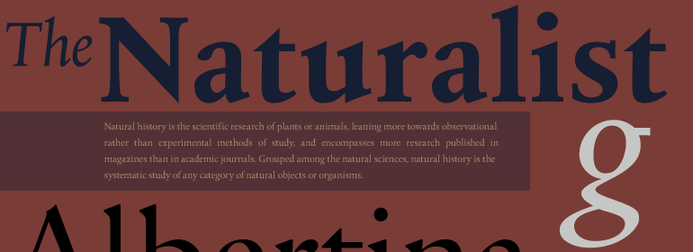
Albertina™
英文名字:AlbertinaMTPro-Regular.TTF
字體介紹
Albertina™
品牌:Monotype
設計師:Brand,Chris; Blokland,Frank E.
發行時間:2018
字庫編碼:Unicode
分類:
字體屬性:
Albertina一款超前的字體。早在20世紀60年代初,著名的書法傢、設計師克Chris Brand就立志要根據書法的原則繪制一種字體。不幸的是,那個時代的排版機對設計師施加瞭許多限制。字符必須畫在一個非常粗糙的網格內,這也定義瞭它們的間距。技術上的限制意味著,斜體設計通常必須與羅馬體的字符寬度相同。設計師們被迫將斜體繪制的比傳統的書法字體或手寫字體要寬得多,間距也更大。
不足為奇的是,第一批Albertina字體的生產進展非常緩慢。Brand將提交他的字符草圖,Monotype Drawing Office would將對其進行修改以與公司的排印設備兼容。然後,新圖紙將被送回到Brand那裡進行批準或者返工。實際上,該過程花瞭很長時間,以至於在該字體設計完成後,它再一次與時代格格不入:Albertina首次是作為Monophoto排字機的照相凸版字體而面世,而不是作為為Monotype排版機量身定制的金屬活字而發佈。
該設計最初是用於Stanley Morison的作品目錄,該目錄於1966年在佈魯塞爾的Albertina Library展出。這款設計的銷量平平。
隨著數字字體技術的出現,Albertina的故事發生瞭翻天覆地的變化。Dutch Type Library的Frank E. Blokland將Brand的原版圖紙作為數字復刻的基礎。“Monophoto版本不受Monotype單位系統的限制,”Blokland回憶說,但是我沒有必要將這些限制合並到數字版本中去。”
在Monotype的全力支持下,出現瞭一個新的Albertina設計,它展示出瞭所有Brand原始設計的優雅和神韻。Brand繪制的基本傢族也發展為三個字重,每個字重都有斜體補充和一組小型大寫字母以及老式數字。”
Albertina was a typeface ahead of its time. It was in the early 1960s when designer Chris Brand, an accomplished calligrapher, aspired to draw a typeface based on the principles of calligraphy. Unfortunately, typesetting machines of that era put many restrictions on designers. Characters had to be drawn within a very coarse grid, which also defined their spacing. Technological limitations meant that italic designs often had to share the same character widths as the romans. Designers were forced to draw italic faces much wider and with more open spacing than what would be typical in calligraphic lettering or hand-set type.
Not surprisingly, production of the first Albertina fonts went very slowly. Brand would submit his character drawings, and the Monotype Drawing Office would modify them to be compatible with the company’s typesetting equipment. The new drawings would then be sent back to Brand for approval or rework. Most were reworked. The process took so long, in fact, that by the time the face was completed it was once again out of phase with the times: instead of being released as metal type for the Monotype composing machines it had been tailored for, Albertina debuted as phototype fonts for the Monophoto typesetter.
The design’s first use was for a catalog of the work of Stanley Morison, exhibited at the Albertina Library in Brussels in 1966. Sales of the design were not remarkable.
With the advent of digital type technology, Albertina’s story took a far happier turn. Frank E. Blokland, of the Dutch Type Library, used Brand’s original, uncompromised drawings as the foundation of a digital revival. The Monophoto version had taken a considerable battering from the limitations of Monotype’s unit system," recalls Blokland, "but there was no need for me to incorporate these restrictions in the digital version."
With the full backing of Monotype and original designer Brand looking over Blokland’s shoulder, a new design for Albertina emerged, displaying all the grace and verve of Brand’s original drawings. The basic family drawn by Brand also grew into three weights, each with an italic complement and a suite of small caps and old style figures."
字體圖片