- MD5值:
Beret™
英文名字:zhuan_BeretLTStd-Light.TTF
字體介紹
Beret™
品牌:Linotype(Monotype)
設計師:Omine,Eduardo
發行時間:2020
字庫編碼:Unicode
分類:無襯線體
字體屬性:
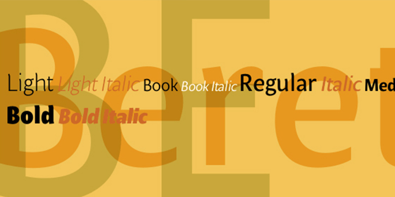
巴西設計師Eduardo Omine設計瞭他的Beret傢族字體,試圖創作出一種溫暖的字體,與20世紀簡潔、極簡的無襯線字體形成對比。Beret最具個性的特點是垂直的筆觸末端。它們輕微彎曲,模擬一種微妙的閃光。像許多經典的無襯線字體(例如,原來的Syntax和Univers),這個傢族不包括真正的(書法)斜體。而是創建瞭一組精巧的斜角。正如Stanley Morison在20世紀20年代和30年代早期所闡述的那樣,當人們想要強調文本中的某些單詞或段落時,這些“羅馬”風格的斜體可能會更有效。
Beret傢族的字體適合於許多應用,在文本和顯示的不同大小上。以下九種字體組成瞭Beret的設計:Beret Light、Beret Light Italic、Beret Book、Beret Book Italic、Beret Regular、Beret Medium, Beret Medium Italic、Beret Bold和Beret Bold Italic。Beret在2003年由Linotype GmbH主辦的國際字體設計大賽中獲得瞭榮譽獎。
Brazilian designer Eduardo Omine designed his Beret family of typefaces in an attempt to create a warm counterpart to the clean, minimalist sans serif of the 20th Century. The most individual characteristics of Beret are the terminals at the ends of its vertical strokes. They are slightly bent", simulating a subtle flare. Like many classic sans-serif typefaces (e.g., the original Syntax and Univers), this family does not include true (calligraphic) italics. Instead, a masterful set of obliques has been created. As Stanley Morison articulated in the early 1920s and 30s, these slanted versions of the regular "roman" faces may even work better when one wishes to emphasize certain words or passages within a text.
The Beret family of typefaces is suitable for numerous applications, in both text and display sizes. The following nine fonts make up the family’s design: Beret Light, Beret Light Italic, Beret Book, Beret Book Italic, Beret Regular, Beret Medium, Beret Medium Italic, Beret Bold, and Beret Bold Italic. Beret was awarded an Honorable Mention in the 2003 International Type Design Contest, sponsored by the Linotype GmbH."
字體圖片