- MD5值:
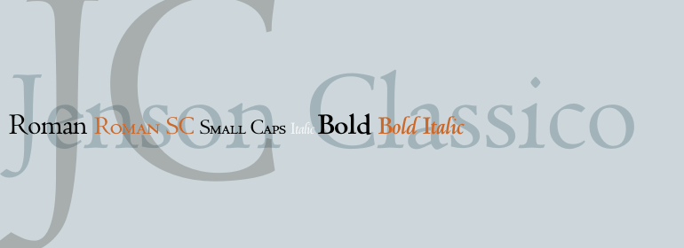
Jenson Classico™
英文名字:JensonClassico-Regular.TTF
字體介紹
Jenson Classico™
品牌:Linotype(Monotype)
設計師:Luin,Franko
發行時間:2018
字庫編碼:Unicode
分類:
字體屬性:
1458年,查理七世派遣法國人Nicolas Jenson到美因茨學習活字印刷術,Gutenberg就在美因茨工作。Jenson本應該帶著他新學的技能回到法國,但他去瞭意大利,就像當時其他巡回印刷工人一樣。從1468年起,他來到瞭威尼斯,在那裡他成為瞭一名打孔工、印刷工和出版人。他可能是第一個使用活字印刷的非德國人,他印刷瞭大約150個版本。從1470年到1480年他去世的這幾個世紀裡,他的書一直是字體設計師的靈感來源。他的羅馬字體通常被稱為第一個真正的羅馬字體。”值得註意的是,幾乎所有的Jensonian Romans都使用小寫的e,也就是眾所周知的“Venetian Oldstyle e”。
20世紀90年代,Robert Slimbach設計瞭他的當代版Adobe Jenson™。它在1996年由Adobe首次發佈,並在2000年重新發佈,作為一個全功能的OpenType字體,具有擴展的語言支持和許多排版改進功能。一個瞭不起的傑作,Adobe Jenson提供瞭一個完整的文本和顯示組合的靈活性; 它具有特殊設計的光學尺寸的巨大字符集,可用於字幕、文本、副標題和顯示。字重范圍包括light、regular、semibold和bold。Jenson沒有設計一個斜體字來搭配他的羅馬字體,所以Slimbach使用瞭Ludovico degli Arrighi在1524-27年裁剪的斜體字作為他的模型。將該傢族用於書籍和雜志的排版,或設計時,會有一種優雅和尊嚴的感覺。
In 1458, Charles VII sent the Frenchman Nicolas Jenson to learn the craft of movable type in Mainz, the city where Gutenberg was working. Jenson was supposed to return to France with his newly learned skills, but instead he traveled to Italy, as did other itinerant printers of the time. From 1468 on, he was in Venice, where he flourished as a punchcutter, printer and publisher. He was probably the first non-German printer of movable type, and he produced about 150 editions. Though his punches have vanished, his books have not, and those produced from about 1470 until his death in 1480 have served as a source of inspiration for type designers over centuries. His Roman type is often called the first true Roman." Notable in almost all Jensonian Romans is the angled crossbar on the lowercase e, which is known as the "Venetian Oldstyle e."
In the 1990s, Robert Slimbach designed his contemporary interpretation, Adobe Jenson™. It was first released by Adobe in 1996, and re-released in 2000 as a full-featured OpenType font with extended language support and many typographic refinements. A remarkable tour de force, Adobe Jenson provides flexibility for a complete range of text and display composition; it has huge character sets in specially designed optical sizes for captions, text, subheads, and display. The weight range includes light, regular, semibold, and bold. Jenson did not design an italic type to accompany his roman, so Slimbach used the italic types cut by Ludovico degli Arrighi in 1524-27 as his models for the italics in Adobe Jenson. Use this family for book and magazine composition, or for display work when the design calls for a sense of graciousness and dignity.
字體圖片