- MD5值:
ITC Vineyard™
英文名字:VINEIRG_.TTF
字體介紹
ITC Vineyard™
品牌:ITC(Monotype)
設計師:Kobayashi,Akira
發行時間:2018
字庫編碼:Unicode
分類:
字體屬性:
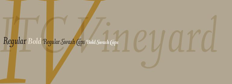
盡管ITC Vineyard的靈感來自18世紀英國名片上的雕字,但它具有其獨特的特征。該字體保留瞭銅版字體的某些特征,但是粗線和細線之間的區別不是很明顯。有幾種草書形式,但大多數字母都是羅馬字母:它們幾乎是直立的,且沒有連接在一起。偶爾的花式會通過各種來源(如名片上的刻字和書法大師的抄本)被隨意解讀。設計師Akira Kobayshi說:“我認為這是一種新型的’copperplate腳本’,它不太正式,也不容易閱讀。大寫字母和數字有明顯不規則的傾斜角度,但字體的古怪使字體頁更加友好而不是冰冷的光輝。ITC Vineyard采用兩種字重設計:常規和粗體。每個變體都包含幾個額外的字符,例如帶有長長字臂的替代小寫字母‘d’、T-h連字、以及一對花體。兩種字重均具有花式大寫字母。花式大寫字母還包括老式數字。Kobayashi指出:“有些花式大寫小寫字母組合會相沖突或顯得笨拙。在這種情況下,我建議使用普通大寫字母。也不應設置為全部花式大寫字母。”
Although inspired by the engraved lettering on eighteenth-century English trade-cards, ITC Vineyard has unusual characteristics of its own. The type retains some quality of copperplate scripts, but the differentiation between thicks and hairlines is not very sharp. There are a few cursive forms, but most of the letters are romanized: they are almost upright and not joining. Occasional flourishes are casually interpreted from various sources such as the lettering on trade-cards and writing masters’ copybooks. “I think it is a new kind of ‘copperplate script’ which is not too formal and easier to read,” claims designer Akira Kobayshi. Irregularities are apparent in the angle of caps and numerals, but the face’s quirkiness gives a type page some friendliness rather than cold brilliancy. ITC Vineyard is designed in two weights: regular and bold. Each variation includes several extra characters such as an alternative lowercase ‘d’ with a long arm, a T-h ligature, swelled rules, and a pair of flourishes. Swash caps are available for both weights. The swash caps variation also includes oldstyle figures. Kobayashi notes: “There are a few swash-cap lowercase combinations that collide or look awkward. In that case, I recommend using the plain caps. Setting all swash cap copy should also be discouraged.”
字體圖片