- MD5值:
ITC Clearface®
英文名字:IT527___.TTF
字體介紹
ITC Clearface®
品牌:ITC(Monotype)
設計師:Caruso,Victor
發行時間:2018
字庫編碼:Unicode
分類:襯線體
字體屬性:
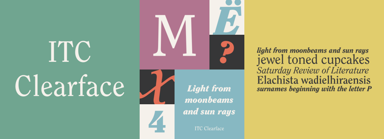
Clearface字體最初是由Morris Fuller Benton於1907年設計。它們的形式展現瞭20世紀初的時代精神(Zeitgeist)。典型且明顯的特征是“ a”和“ k”的字形。ATF版本不包含附帶的斜體。
1978年,ITC的Victor Caruso獲得ATF的許可,允許其基於Clearface的字形開發一種新的襯線字體以及與其配套的斜體。於是就有瞭ITC Clearface,一款具有明顯的筆畫對比和斜體字重的襯線字體。小寫字母a、c和f淚珠形的結尾(也可以在Caslon中找到)定義瞭該字體的特征。該字體的設計還有幾個明顯特征是其小型(幾乎是平板)襯線、較高的x高度以及不太明顯的筆畫對比。ITC Clearface具有歷史感,既適合文本也適合標題,但其略微細窄的特點使其在限定的范圍內效果最好。
The Clearface types were originally designed by Morris Fuller Benton in 1907. Their forms expressed the Zeitgeist of the turn of the 20th century; typical and distinguishing characteristics are the forms of the a" and the "k." The ATF version did not include an accompanying Italic.
In 1978, ITC’s Victor Caruso was licensed by ATF to develop a new serif typeface and matching italic based on the forms of Clearface. The result was ITC Clearface, a serif typeface with marked stroke contrast and italic weights. The teardrop-formed endings of the lowercase a, c and f (also found in Caslon) define the character of the face. The type’s design is also distinguished by its small — almost slab — serifs, a large x-height, and little stroke contrast. ITC Clearface, with its historical touch, is good for both texts and headlines, but its slightly condensed nature performs at its best when it is allowed its space.
字體圖片