- MD5值:
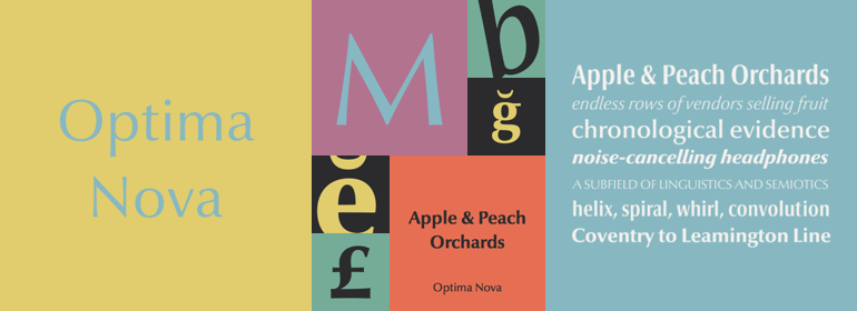
Optima nova®
英文名字:LT_55476.TTF
字體介紹
Optima nova®
品牌:Linotype(Monotype)
設計師:Zapf,Hermann; Kobayashi,Akira
發行時間:2018
字庫編碼:Unicode
分類:無襯線體
字體屬性:
Optima™由Hermann Zapf設計,是他最成功的字體。1950年,在參觀佛羅倫薩的聖十字教堂時,Zapf作瞭他的第一個草圖。他從大約1530年被切割的墓碑板上繪出字母,由於當時他身邊沒有其他的紙,這些草圖是在兩張1000裡拉的鈔票上完成的。這些來自教堂地板上的字母激發瞭創作Optima的靈感,這是一種按比例和字符排列的古典羅馬字體,但沒有襯線。字體是按照黃金比例設計的。1952年,經過仔細的易讀性測試,第一批圖紙完成。
這款字體是由法蘭克福D. Stempel AG公司著名的沖床切割師Augustug Rosenberger設計的。Optima於1958年發佈。憑借其無襯線字體的清晰,簡單的優雅以及其溫暖的人情味,該傢族已在世界范圍內廣受歡迎。2002年,終於有可能生產出不受技術限制和折衷的數字字母,並且在首次繪制草圖後的50多年後,完成瞭Optima傢族的擴展和重新設計,並發佈瞭Optima nova。
Hermann Zapf和日本字體設計師小林章(Akira Kobayashi)合作完成瞭這個項目,包括對現有字重的重新設計以及為40種字體添加瞭幾個新字重。增加瞭小型大寫字母、老式數字、Light、 Heavy、和Condensed字重。
原來的 Optima從來沒有制造一個真正的斜體,隻有一個斜版的羅馬字重。Optima™ nova擁有一傢族設計精美的真實斜體; 新的斜體形式,e,f和g的新斜體形式尤其值得註意。
標題字形包括大寫字母與特殊和不尋常的字母組合和連字,使它成為標題,標志和廣告的一個很好的選擇。Optima仍然是一種通用字體; Optima nova適用於從書籍文本到標牌的任何東西。”
Optima™ was designed by Hermann Zapf and is his most successful typeface. In 1950, Zapf made his first scetches while visiting the Santa Croce church in Florence. He sketched letters from grave plates that had been cut about 1530, and as he had no other paper with him at the time, the sketches were done on two 1000 lire bank notes. These letters from the floor of the church inspired Optima, a typeface that is classically roman in proportion and character, but without serifs. The letterforms were designed in the proportions of the Golden Ratio. In 1952, after careful legibility testing, the first drawings were finished.
The type was cut by the famous punchcutter August Rosenberger at the D. Stempel AG typefoundry in Frankfurt. Optima was produced in matrices for the Linotype typesetting machines and released in 1958. With the clear, simple elegance of its sans serif forms and the warmly human touches of its tapering stems, this family has proved popular around the world. In 2002, when it was finally possible to produce digital alphabets without technical limitations and compromises, and more than 50 years after the first sketches, an expansion and redesign of the Optima family was completed and released as Optima nova.
Hermann Zapf and Japanese type designer Akira Kobayashi collaborated on the project, which included re-working of the existing weights and the addition of several new weights for a total of 40 fonts. Small caps, Old style Figures, light, heavy, and condensed fonts have been added.
The original Optima was never manufactured with a real italic, only an oblique version of the roman. Optima™ nova has a complete range of beautifully designed real italics; the new italic forms , of the e, f and g are especially notable.
The titling face includes capital letters with special and unusual letter combinations and ligatures, making it an excellent choice for headlines, logos and advertising purposes. Optima continues to be an all-purpose typeface; and Optima nova works for just about anything from book text to signage."
字體圖片