- MD5值:
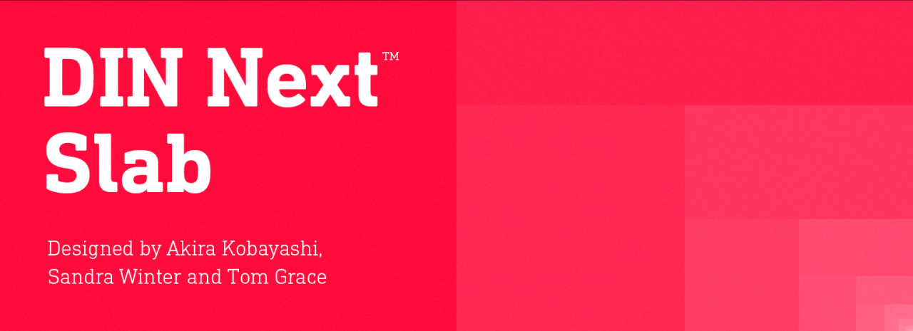
DIN® Next Slab
英文名字:DINNextSlabPro-Regular.TTF
字體介紹
DIN® Next Slab
品牌:Monotype
設計師:Kobayashi,Akira; Winter,Sandra; Grace,Tom
發行時間:2018
字庫編碼:Unicode
分類:
字體屬性:
如今,倍受歡迎的DIN Next有更多的設計可能性。憑借其技術和中性特征,DIN Next在當代排印中獲得瞭永久的地位。現在,DIN Next Slab進一步擴展瞭該字體傢族,提供瞭新的設計潛力。
接下來的DIN Next Slab,也是在Akira Kobayashi的指導下創作的。在Sandra Winter和Tom Grace的團隊中,Kobayashi根據DIN Next的優化形狀創建新的字體變體。擴展將使流行的字體更加靈活和多樣化。除此之外,幾何粗襯線突出瞭字體的技術和形式特征,並強調瞭DIN Next的中心設計元素。
但是,該團隊確實需要克服一些挑戰。雖然將DIN Next Light與粗襯線體聯系起來相對容易一些,可當使用Black樣式時可用空間的大小很快就沒有瞭。Winter解釋說,為瞭在空間、字母和襯線形狀之間找到折衷方案,必須進行許多測試和試驗。修改字重或僅單側襯線對比度的實驗很快就被放棄瞭。字體的主要特點、技術特征以及強大特性都有很大的變化。不過,還可以略微簡化一些字母的形狀,例如’k’或’x’。為瞭使字體具有一致的外觀,這些變化(最初是以Black樣式開發的)被應用於所有字重。
與DIN Next一樣,DIN Next Slab也包含瞭從Ultralight到Black的七個字重,且每個字重都有其相應的斜體。所有樣式都有各種各樣的字符集,以及四個中等的粗細都有可用的小型大寫字母。
DIN Next Slab與DIN Next的樣式非常協調:基本字形和字重相同。兩種版本的字體都可以完美地協同工作,不僅可以在標題和正文中使用,還可以在文本中使用。通過新的DIN Next Slab,Monotype可以持續擴展DIN Next超級傢族。使用DIN Next Slab,您不僅可以在標題中,甚至也可以在文本中強調字體的技術特性和形式特征。如此一來,由於DIN Next的不同風格完美地結合在一起,您就可以用於更多新的、多樣化的應用。
Now even more design possibilities with the popular DIN Next. With its technical and neutral character, DIN Next has earned a permanent place in contemporary typography. Now, DIN Next Slab expands the font family further, offering new design potential.
Now comes the next step, DIN Next Slab, also produced under the direction of Akira Kobayashi. On a team with Sandra Winter and Tom Grace, Kobayashi is creating the new font variant based on the optimized shapes of DIN Next. The expansion will make the popular font all the more flexible and versatile. Apart from that, the geometric slab serifs underline the technical and formal nature of the font and emphasize a central design element of DIN Next.
However, the team did have some challenges to overcome. While it is relatively easy to imagine DIN Next Light with slab serifs, the amount of available space quickly disappears when it comes to the Black styles. Winter explains that many tests and trials were necessary to find a compromise between space, letters and the serif shapes. Experiments with modified contrast in the weight or only one-sided serifs were quickly abandoned. The central, technical and powerful character of the font changed too much. Nevertheless, it was necessary to simplify slightly the shape of some letters, such as the ‘k’ or ‘x’, for example. These changes, first developed in the Black styles, were applied to all weights in order to lend the font a consistent appearance.
Like DIN Next, DIN Next Slab also has seven weights, which cover the range from Ultralight to Black, each with matching italic. There are various character sets in all of the styles and the four middle weights have small capitals available.
DIN Next Slab harmonizes perfectly with the styles of DIN Next: the basic letterforms and weights are identical. Both versions of the font can work together perfectly, not just in headlines and body text, but also within a text; they complement each other very well as design variations. With the new DIN Next Slab, Monotype expands the DIN Next super family consistently. With DIN Next Slab, you can underscore the technical and formal nature of the understated font not only in headlines, but in texts, as well. In this way, you have new and diverse potential for application, thanks to the way the different styles of DIN Next combine perfectly.
字體圖片