- MD5值:
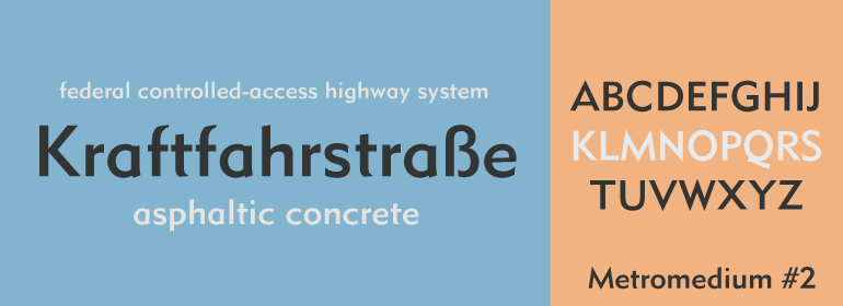
Metromedium™ #2
英文名字:Metromedium2Com.TTF
字體介紹
Metromedium™ #2
品牌:Linotype(Monotype)
設計師:Dwiggins,William A.
發行時間:2018
字庫編碼:Unicode
分類:無襯線體、正文字體
字體屬性:
Metro傢族是美國平面設計師William Addison Dwiggins(簡稱W.A.D.)從1927年開始設計的第一個字體。該項目是源於Dwiggins對當今新的歐洲無襯線字體(如Futura,Erbar和Kabel)的不滿,他曾在他開創性的書籍《Layout in Advertising》中表達過這種感覺。在Mergenthaler Linotype的敦促下,Dwiggins提出瞭解決該問題的解決方案,並開始瞭長達數十年的專業合作關系。
發佈的第一個Metro傢族字體是Metroblack,由Linotype於1929年推向市場。(Metroblack#2™是Mergenthaler Linotype最終投入生產的兩個版本中的唯一一個有數字形式的)。在歐洲,當時的人文主義特征要比幾何風格更為流行,Dwiggins描繪出瞭他認為是適用於標題和廣告文案最理想的無襯線樣式。 Metroblack的特征比現代主義更溫暖,且字體都是矯飾的曲線以及有尖角的末端(Metroblack的字母Q特別漂亮)。
Metro傢族的其他字重,Metromedium#2™和Metrolite#2™,是在Dwiggins的監督下由Mergenthaler Linotype的設計工作室完成的。
盡管誕生於四分之三個世紀以前,Metro傢族字體已經很老瞭,仍然是一個受歡迎的無襯線傢族。
盡管與Futura這樣的暢銷字體相比,Metro的使用頻率更低,但它仍有許多不同的用途。幾十年來,該字體一直出現在歐洲和北美的報紙和雜志上,當用於徽標和企業標識時,甚至有助於創建出色的品牌形象。
Dwiggins是20世紀最具影響力的平面設計師和字體設計師之一。他在Linotype Originals中還有其他幾種優質的字體,包括襯線文本字體Electra™和New Caledonia™,以及Caravan™(一種排印裝飾字體)。”
American graphic designer William Addison Dwiggins’ (W.A.D. for short) first typefaces were the Metro family, designed from 1927 onward. The project grew out of Dwiggins’ dissatisfaction with the new European sans serif typefaces of the day, such as Futura, Erbar, and Kabel, a feeling he expressed in his seminal book Layout in Advertising. Urged by Mergenthaler Linotype to create a solution for the problem, Dwiggins began a professional relationship that would span over the next few decades.
The first Metro family typeface to be released was Metroblack, brought to market by Linotype in 1929 (Metroblack #2™ the only one of the two versions that Mergenthaler Linotype eventually put into production which is available in digital form). With more of a humanist quality than the geometric styles popular in Europe at the time, Dwiggins drew what he believed to be the ideal sans serif for headlines and advertising copy. Metroblack has a warmer character than the Modernists’ achievements, and the type is full of mannered curves and angled terminals (Metroblack also has an astoundingly beautiful Q).
The other weights of the Metro family, Metromedium #2™ and Metrolite #2™, were designed by Mergenthaler Linotype’s design office under Dwiggins’ supervision.
Despite having been created more than three-quarters of a century ago, the Metro family types have aged well, and remain a popular sans serif family. Although spec’d less often than other bestsellers, like Futura, Metro continues to find many diverse uses. The typeface has appeared throughout Europe and the North America for decades in newspapers and magazines, and can even help create a great brand image when used in logos and corporate identity.
Dwiggins ranks among the most influential graphic designers and typeface designers of the 20th Century. He has several other quality fonts in the Linotype Originals, including the serif text faces Electra™ and New Caledonia™, as well as Caravan™, a font of typographic ornaments."
字體圖片