- MD5值:
Avenir® Next Rounded
英文名字:AvenirNextRoundedPro-Reg.TTF
字體介紹
Avenir® Next Rounded
品牌:Linotype(Monotype)
設計師:Frutiger,Adrian; Kobayashi,Akira
發行時間:2018
字庫編碼:Unicode
分類:
字體屬性:
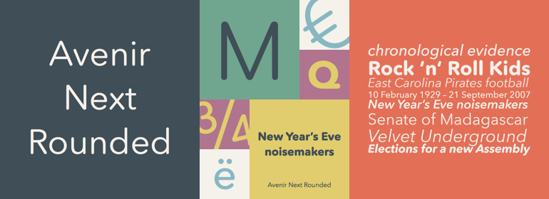
Adrian Frutiger於1988年設計瞭Avenir™,他對無襯線字體有多年的興趣。在接受Linotype的采訪時,他說他覺得有義務設計出一種線性的sans字體,既要遵循Erbar和Futura的傳統,又要利用20世紀的經驗和風格的發展。單詞Avenir在法語中的意思是“未來”, 並暗示該字體應歸功於Futura。但與Futura不同的是,Avenir不是純粹的幾何圖形;它的垂直筆劃比水平筆劃粗,一個“o”不是一個完美的圓,還有縮短的上升筆劃。這些細微的差別有助於可讀性,並為Avenir的文字和標題提供瞭和諧而合理的外觀。Avenir™ Next是一個Platinum Collectionfont傢族,最近發佈,是對現有Avenir的重大改進和擴展。它包括新的小型大寫字母,新設計的真正斜體,和一個完整的細窄字重。Avenir™Next是一個多功能的無襯線字體傢族,適用於從書籍到標識,再到廣告的大型復雜項目。
Adrian Frutiger designed Avenir™ in 1988, after years of having an interest in sans serif typefaces. In an interview with Linotype, he said he felt an obligation to design a linear sans in the tradition of Erbar and Futura, but to also make use of the experience and stylistic developments of the twentieth century. The word Avenir means ‘future’ in French and hints that the typeface owes some of its interpretation to Futura. But unlike Futura, Avenir is not purely geometric; it has vertical strokes that are thicker than the horizontals, an """"o"""" that is not a perfect circle, and shortened ascenders. These nuances aid in legibility and give Avenir a harmonious and sensible appearance for both texts and headlines. Avenir™ Next is a Platinum Collectionfont family, recently released as a major improvement and extension to the existing Avenir. It includes new small caps, newly designed true italics, and a complete new range of condensed weights. Avenir™ Next is a versatile sans serif family, ready for large and complex projects from books to signage to advertising.
字體圖片