- MD5值:
Vesterbro
英文名字:Vesterbro-Light.TTF
字體介紹
Vesterbro
品牌:Black[Foundry]
設計師: Alisa Nowak, Ilya Naumoff,Jeremie Hornus
發行時間:2018
字庫編碼:Unicode
分類:襯線體
字體屬性:
Vesterbro是Black[Foundry]的新襯線字體,以哥本哈根老西門曾經所在的市區命名。這是JérémieHornus的創意,他與Alisa Nowak和Ilya Naumoff合作開發瞭該類型系列。
Vesterbro系列的核心設計是Poster。富有想象力的高對比度字體結合瞭Scottish字體和Garalde字體的特征。 Vesterbro Poster比大多Didot字體在展示上顯得更親和。
它具有友好的形狀,具有寬大的x高和短襯線。傾斜的軸和柔和的曲線使Vesterbro Poster具有誘人和快活的個性。隻需看看小寫字母“ e”上那燦爛的笑容,或“&”號如何連接下一個單詞。該團隊對這種印刷混搭的工作效果感到驚訝,得出瞭具有相同屬性的文本版本。
常規砝碼的襯線字體更加明顯,對比度也很低,在頁面上顯得沉穩而自信。字母“ a”,“ c”和“ f”上的末端增加瞭優雅的書法風格。隨著重量的增加,字體在不失去柔美魅力的情況下獲得瞭沖擊感。感謝Black [Foundry]的跨國團隊,在Vesterbro開發的早期就添加瞭希臘字母和西裡爾字母。
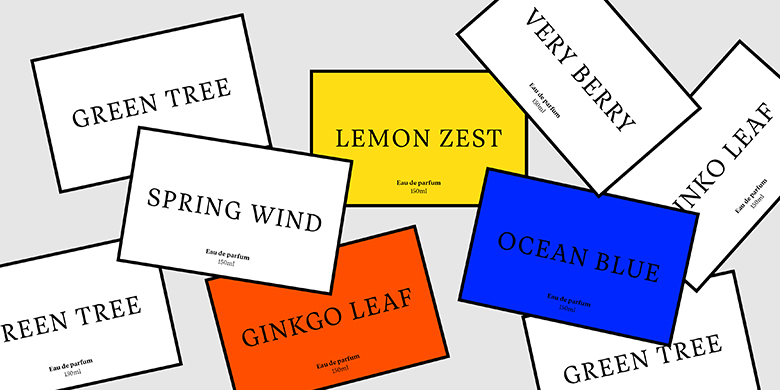
全面的字符集包括多種類型的數字,廣泛的連字集和完整的箭頭補充。 Vesterbro的文字大小令人愉悅,大尺寸使用時會引人註目,它是一種用於全球交流的通用類型系列,可應用於任何設計項目,從編輯設計和圖形標識到廣告,品牌和包裝。
"Named after the city district located where the old Western Gate of Copenhagen used to be, Vesterbro is an attractive new serif face from Black[Foundry]. It is the brainchild of Jérémie Hornus, who developed the type family in collaboration with Alisa Nowak and Ilya Naumoff
The core design of the Vesterbro family is the Poster weight. The imaginative high-contrast typeface combines characteristics from Scottish and Garalde models. Vesterbro Poster is warmer than most Didot-inspired display faces.
It has friendly, organic shapes, with a generous x-height and short serifs. Its tilted axis and supple curves lend Vesterbro Poster an inviting, jovial personality; just look at that radiant smile on the lowercase ‘e,’ or how the ampersand licks the next word. Surprised at how well this typographic mashup works, the team derived a text version with the same properties.
The Regular weight has more pronounced serifs and a fairly low contrast, giving it a calm yet confident look on the page. Leaf terminals on letters like ‘a,’ ‘c,’ and ‘f’ add an elegant calligraphic touch. As the weight increases, the typeface gains impact without losing its supple charm. Thanks to the multinational team at Black[Foundry], the Greek and Cyrillic alphabets were added early in the development of Vesterbro.
The comprehensive character set includes several types of numerals, an extensive ligature set, and a full complement of arrows. Pleasantly readable in text sizes and attention-grabbing when used big, Vesterbro is a versatile type family for global communication that can be applied to any design project, from editorial design and graphic identities to advertising, branding and packaging."
字體圖片

