- MD5值:
Neue Frutiger®
英文名字:FrutigerNeueLTW1G-Regular.TTF
字體介紹
Neue Frutiger®
品牌:Linotype(Monotype)
設計師:Frutiger,Adrian; Kobayashi,Akira
發行時間:2017
字庫編碼:Unicode
分類:無襯線體
字體屬性:
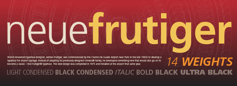
上世紀70年代初,巴黎戴高樂機場在規劃新建機場時曾決定,機場的導視系統必須盡可能使用最清晰、最易讀的字體。所有標識的開發都交給瞭Adrian Frutiger和他的工作室。該團隊非常有效地完成瞭他們的任務,很快,一些客戶對他們的字體產生瞭巨大的需求,他們希望將其應用於其他導視系統,以及印刷材料。Frutiger®字體不僅為導視系統建立瞭新的標準,而且還為一傢族需要清晰易讀設計的其他領域建立瞭新標準,特別是對於小尺寸字體和基礎性字體。1977年,由於這一需求而出現的字體傢族以“Frutiger”的名字被添加到Linotype字體庫中。
Frutiger Next,創作於1999年,它是對Frutiger更進一步的開發。它是基於一個新的想法,其最明顯的視覺特征是較大的x字高,小寫字母相對於大寫字母有更明顯的升部和降部。這個新設計創造瞭一種平衡,且字間距非常窄。Frutiger Next滿足瞭對節省空間的現代人文主義無襯線字體的需求。
2009年的Neue Frutiger是對1977年Frutiger傢族的重新思考,由小林章(Akira Kobayashi)與Adrian Frutiger密切合作對其進行瞭修訂和改進。盡管做出瞭種種修改,但這個“New Frutiger”仍然可以與原來的Frutiger傢族完美契合,而且有利於對已有字重和風格進行和諧改進。這種完美的混合保證瞭Neue Frutiger擁有與Frutiger相同的字符高度。因此,已經存在的Frutiger樣式可以在必要時與Neue Frutiger混合使用。同樣,Neue Frutiger也可以與Frutiger Serif一起使用。
“Neue Frutiger 1450” 是新增加的字重。尤其是為瞭滿足新發佈的德國DIN 1450標準的要求,我們與Adrian Frutiger共同為Neue Frutiger構建瞭幾個特殊的字重。為瞭更好地與大寫字母“I”區分,小寫字母 “l”的基線處是彎曲的,此外,數字“0”的內部有一個點,這樣能更好地與大寫“O”區分開來,而數字“1”的底部有襯線。該字體還包含瞭常規Neue Frutiger字體的原始字型,可以通過Opentype功能訪問到。”
During planning for the new Roissy Charles de Gaulle airport in Paris at the beginning of the 1970s, it was determined that the airport’s signage system had to include the clearest and most legible lettering possible. The development of all signage was put into the hands of Adrian Frutiger and his studio. The team carried out their task so effectively that a huge demand for their typeface soon arose from customers who wanted to employ it in other signage systems, and in printed materials as well. The Frutiger® typeface not only established new standards for signage, but also for a range of other areas in which a clear and legible design would be required, especially for small point sizes and bread-and-butter type. The typeface family that which emerged as a result of this demand was added into the Linotype library as "Frutiger" in 1977.
Frutiger Next, created in 1999, is a further development of Frutiger, not necessarily a rethinking of the design itself. It was based on a new concept, the most obvious visual characteristics of which is the larger x-height, as well as a more pronounced ascender height and descender depth for lower case letters in relation to capitals. This new design created a balanced image and included considerably narrower letterspacing. Frutiger Next meets the demand for a space-saving, modern humanist sans.
2009’s Neue Frutiger is a rethink of the 1977 Frutiger family, now revised and improved by Akira Kobayashi in close collaboration with Adrian Frutiger. Despite the various changes, this "New Frutiger" still fits perfectly with the original Frutiger family, and serves to harmoniously enhance the weights and styles already in existence. The perfect mix, guaranteed Neue Frutiger has the same character height as Frutiger. As a result of this, already existing Frutiger styles can be mixed with Neue Frutiger where necessary. Likewise, Neue Frutiger is perfect for use alongside Frutiger Serif.
Newly added are the "Neue Frutiger 1450" weights. Especially for the requirements of the newly released German DIN 1450 norm we have built together with Adrian Frutiger specific weights of the Neue Frutiger. The lowercase l" is curved at the baseline to better differentiate between the cap "I", additionally the number "0" has a dot inside to better differentiate between the cap "O", and the number "1" is now a serifed 1. The font contains additionally the origin letterforms from the regular Neue Frutiger font which can be accessed through an Opentype feature."
字體圖片