- MD5值:
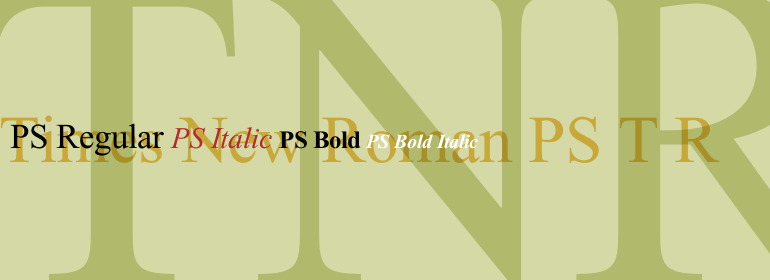
Times New Roman PS
英文名字:TimesNewRomPSPro.TTF
字體介紹
Times New Roman PS
品牌:Monotype
設計師:Morison,Stanley; Lardent,Victor
發行時間:2018
字庫編碼:Unicode
分類:襯線體
字體屬性:
1931年,倫敦《泰晤士報》(The Times of London)委托Stanley Morison與Monotype公司設計一款新的文本字體,此前Morison曾寫過一篇文章批評《泰晤士報》的印刷差以及排印落後於時代。新設計由Stanley Morison指導,《泰晤士報》廣告部的藝術傢Victor Lardent執筆。Morison使用瞭一種較老的字體Plantin作為他設計的基礎,但在可讀性和空間節省方面進行瞭修改(這一直是報紙所關註的重要)。由於報紙使用的舊字體一直被稱為“Times Old Roman”,Morison修訂後的版本就變成瞭“Times New Roman”。1932年10月,倫敦《泰晤士報》首次推出瞭這款新字體,一年之後,這款字體就被用於商業銷售。Linotype版本被簡單地為“Times”,它是為整行鑄造排字技術而進行的優化,但在基本設計上存在細微的差異。倫敦《泰晤士報》使用的這款字體非常成功,它使用瞭比大多數報紙更高等級的新聞紙。更好、更白的紙張增強瞭新字體的高對比度和銳利的襯線,同時形成瞭其閃閃發光的、現代的外觀。1972年,Walter Tracy為倫敦《泰晤士報》設計瞭Times Europa。這是一個更強健的版本,它需要滿足報紙印刷的最新需求: 更快的印刷速度和更便宜的紙張。自20世紀40年代以來,Times字體傢族作為一種雜志和書籍的字體在美國大受歡迎。由於《泰晤士報》的多功能性和可讀性,它在世界各地仍然非常受歡迎。由於它是大多數計算機和數字打印機上的標準字體,所以它已經成為辦公室裡普遍熟悉的常用字體。Times®、Times® Europa以及Times New Roman® 對於提案、年度報告、辦公室信件、雜志和報紙而言都是很好的選擇。
Linotype提供瞭這種字體的許多版本:
Times®是Times的通用版本,以前常用作Lonotype整行鑄造排字機的字模。羅馬體、斜體、粗體以及粗斜體這四個基本字重是在大多數打印機上使用的標準字體。也有小寫字母、老式的數字、音標和中歐文字。
Times® Ten是專為較小文本設計的版本(12pt及以下);它的字符更寬、細筆畫比較堅固。Times Ten有很多種字重適用於拉丁排印,適用於中歐、西裡爾和希臘排印的也有幾個字重。
Times® Eighteen是標題版本,適用於18pt或者更大號的字體。字符被巧妙地縮窄瞭且細筆畫更出色。
In 1931, The Times of London commissioned a new text type design from Stanley Morison and the Monotype Corporation, after Morison had written an article criticizing The Times for being badly printed and typographically behind the times. The new design was supervised by Stanley Morison and drawn by Victor Lardent, an artist from the advertising department of The Times. Morison used an older typeface, Plantin, as the basis for his design, but made revisions for legibility and economy of space (always important concerns for newspapers). As the old type used by the newspaper had been called Times Old Roman," Morison’s revision became "Times New Roman." The Times of London debuted the new typeface in October 1932, and after one year the design was released for commercial sale. The Linotype version, called simply "Times," was optimized for line-casting technology, though the differences in the basic design are subtle. The typeface was very successful for the Times of London, which used a higher grade of newsprint than most newspapers. The better, whiter paper enhanced the new typeface’s high degree of contrast and sharp serifs, and created a sparkling, modern look. In 1972, Walter Tracy designed Times Europa for The Times of London. This was a sturdier version, and it was needed to hold up to the newest demands of newspaper printing: faster presses and cheaper paper. In the United States, the Times font family has enjoyed popularity as a magazine and book type since the 1940s. Times continues to be very popular around the world because of its versatility and readability. And because it is a standard font on most computers and digital printers, it has become universally familiar as the office workhorse. Times?, Times? Europa, and Times New Roman? are sure bets for proposals, annual reports, office correspondence, magazines, and newspapers.
Linotype offers many versions of this font:
Times? is the universal version of Times, used formerly as the matrices for the Linotype hot metal line-casting machines. The basic four weights of roman, italic, bold and bold italic are standard fonts on most printers. There are also small caps, Old style Figures, phonetic characters, and Central European characters.
Times? Ten is the version specially designed for smaller text (12 point and below); its characters are wider and the hairlines are a little stronger. Times Ten has many weights for Latin typography, as well as several weights for Central European, Cyrillic, and Greek typesetting.
Times? Eighteen is the headline version, ideal for point sizes of 18 and larger. The characters are subtly condensed and the hairlines are finer."
字體圖片