- MD5值:
ITC Quay Sans®
英文名字:QuaySansITCCom-Medium.TTF
字體介紹
ITC Quay Sans®
品牌:ITC(Monotype)
設計師:Quay,David
發行時間:2018
字庫編碼:Unicode
分類:無襯線體、正文字體
字體屬性:
倫敦的設計師David Quay於1990年設計瞭ITC Quay Sans。自從20世紀90年代以來,功能主義的歐洲無襯線字體一直是字體設計的主導力量,而ITC Quay sans的前身之一就是基於19世紀的Grotesk字體比例設計的。Grotesk,德語為無襯線字體,定義瞭無襯線運動的整個分支,該運動於20世紀50年代以Helvetica字體的設計達到瞭頂峰。
ITC Quay Sans是由非常簡單清晰的字母組成。整個字母表中的筆畫字重都大同小異。每個尾端最後都微微張開,為設計增加瞭一點層次。這有助於防止千篇一律,當在一大段文本中重復出現無數個單一字重的筆畫字母時,就很危險。ITC Quay Sans是一款非常易讀的字體。它的所有尺寸表現良好。
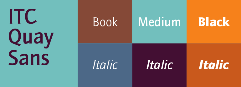
ITC Quay Sans字體有六種字重可供選擇:Book,Book Italic,Medium,Medium Italic,Black和Black Italic。ITC Quay Sans與Hans Eduard Meier的Syntax以及Tim Ahrens的Linotype Aroma類似。”
London-based designer David Quay designed ITC Quay Sans in 1990. One of the precursors to the long run of functionalist European sans serif faces that has been a dominating force in type design since the 1990s, ITC Quay sans is based on the proportions of 19th Century Grotesk faces. Grotesk, the German word for sans serif, defines an entire branch of the sans serif movement, which culminated in the 1950s with the design of Helvetica.
ITC Quay Sans is made up of very simple, legible letters. The weights of the strokes throughout the alphabet vary very little. Microscopic flares on the ends of each terminal add a bit of dimension to the design. This helps prevent the onset of the monotony, a danger when one repeats countless near mono-weight stroked letters throughout a large body of text. ITC Quay Sans is a very readable face; it works equally well in all sizes.
Six fonts of the ITC Quay Sans typeface are available: Book, Book Italic, Medium, Medium Italic, Black, and Black Italic. ITC Quay Sans is similar to Hans Eduard Meier’s Syntax, and Tim Ahrens’ Linotype Aroma."
字體圖片