- MD5值:
Garamond Classico™
英文名字:GaramondClassico-Regular.TTF
字體介紹
Garamond Classico™
品牌:Linotype(Monotype)
設計師:Luin,Franko
發行時間:2018
字庫編碼:Unicode
分類:
字體屬性:
16世紀上半葉,Claude Garamond(約1480-1561年)為巴黎學者印刷商Robert Estienne刻字,其羅馬體是根據Francesco Griffo在1495年為威尼斯印刷商Aldus Manutius切割的字體而設計的。Garamond在後來的版本中完善瞭其羅馬體,隨著他作為字沖雕刻師技能的提高,其中也加入瞭他自己的理念。在他1561年去世後,Garamond沖床被搬到瞭位於安特衛普的Christoph Plantin的印刷辦公室,在這裡被Plantin使用瞭數十年,至今仍保存於Plantin-Moretus博物館中。Garamond的其他沖床都進入瞭Egenolff-Berner的法蘭克福鑄造廠,Egenolff-Berner於1592年發佈瞭一個樣本,成為後來的學者和設計師瞭解有關Garamond字體的一個重要的信息來源。1621年,即Garamond逝世六十年後,法國印刷商Jean Jannon(1580-1635)發行瞭一種字體樣本,它的特征與Garamond設計類似,但是其字母的斜度和軸線更加不對稱且不規則。Jannon的字體銷聲匿跡瞭大約200年,但1825年在法國國傢印刷局被重新發現,當時它們被錯誤地認為是Claude Garamond。直到1927年Beatrice Warde的研究才揭示瞭它們的真正起源。20世紀早期,Jannon的字體被用來印刷一本法國的印刷史,這使人們重新註意到法國排印和Garamond字體。這激發瞭現代復興的開始。一些基於Jannon字體的錯誤模型,而另一些則基於原始的Garamond字體。Garamond字體的斜體有時是基於Robert Granjon (1513-1589)切割的字體,Robert Granjon創作過Plantin,而且他的字體也在Egenolff-Berner的樣本上。Linotype有多個Garamond版本的字體。雖然它們在設計和原型上各不相同,但它們均被視為法國文藝復興時期風格的獨特代表;它們的優雅和可讀性都很易於識別。
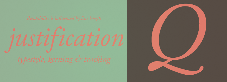
Garamond Classico™由Franko Luin於1993年設計,並以Jean Jannon的形式為基礎。它包括四種字重和小型大寫字母。
Claude Garamond (ca. 1480-1561) cut types for the Parisian scholar-printer Robert Estienne in the first part of the sixteenth century, basing his romans on the types cut by Francesco Griffo for Venetian printer Aldus Manutius in 1495. Garamond refined his romans in later versions, adding his own concepts as he developed his skills as a punchcutter. After his death in 1561, the Garamond punches made their way to the printing office of Christoph Plantin in Antwerp, where they were used by Plantin for many decades, and still exist in the Plantin-Moretus museum. Other Garamond punches went to the Frankfurt foundry of Egenolff-Berner, who issued a specimen in 1592 that became an important source of information about the Garamond types for later scholars and designers. In 1621, sixty years after Garamond’s death, the French printer Jean Jannon (1580-1635) issued a specimen of typefaces that had some characteristics similar to the Garamond designs, though his letters were more asymmetrical and irregular in slope and axis. Jannon’s types disappeared from use for about two hundred years, but were re-discovered in the French national printing office in 1825, when they were wrongly attributed to Claude Garamond. Their true origin was not to be revealed until the 1927 research of Beatrice Warde. In the early 1900s, Jannon’s types were used to print a history of printing in France, which brought new attention to French typography and the Garamond" types. This sparked the beginning of modern revivals; some based on the mistaken model from Jannon’s types, and others on the original Garamond types. Italics for Garamond fonts have sometimes been based on those cut by Robert Granjon (1513-1589), who worked for Plantin and whose types are also on the Egenolff-Berner specimen. Linotype has several versions of the Garamond typefaces. Though they vary in design and model of origin, they are all considered to be distinctive representations of French Renaissance style; easily recognizable by their elegance and readability.
Garamond Classico™ was designed by Franko Luin in 1993, and was based on the forms of Jean Jannon. It includes four weights and small caps.
字體圖片