- MD5值:
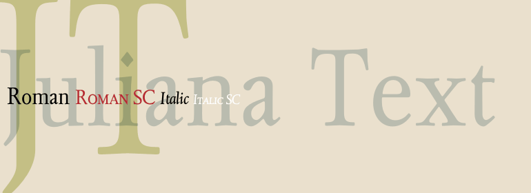
Juliana® Text
英文名字:JulianaText-Roman.TTF
字體介紹
Juliana® Text
品牌:Linotype(Monotype)
設計師:Tracy,Walter
發行時間:2018
字庫編碼:Unicode
分類:
字體屬性:
Juliana是1958年由Sem Hartz設計的一款完全原創的傳統風格字體。
Juliana Text是其數字復刻版本,由Sam Berlow將其數字化。
Juliana的許多細節都能表現出它是一款原創字體,盡管它會讓人想起16世紀上半葉在意大利創作的那些漂亮字體。這些大寫字母的風格,部分 “古典”,特性不怎麼突出(這是很好的)。K和R的字尾平滑;S的頂端和底端都比較平;W相交的方式很傳統。大寫字母可能略低於小寫字母的升部。小寫字母沒有特別的地方; 其形式在一些小細節上與其他字體有所不同。
b的尾端有襯線;小寫字母k的末端和大寫字母的一樣; i和j的點是菱形的(Juliana中句號的設計也是一樣的)。h,m和n的拱形部分相對較平。小寫字母w與大寫字母W並不相同,它沒有相交。
重要的是,設計師創作新的字體時並不是把字母設計的顯眼;而是通過他自己對羅馬字母的固有理解來表達克制和尊嚴。
Juliana is a face of traditional style yet entirely original. Designed by Sem Hartz in 1958.
Juliana Text is the digital revival of this version. This was now digitized by Sam Berlow.
Juliana shows lots of detail that it is an original design, though reminiscent of the handsome type faces produced in Italy in the first part of the sixteenth century. The capitals are partly ‘classic’ in style, with very few outstanding features (which is all the good). The K and R have flowing terminals; the S is comparatively level at head and foot; the U has arms of equal weight; the W is crossed in traditional fashion. The capitals are probably slightly less tall than the ascending lowercase letters. The lowercase has no eccentricities; its forms are different from other faces only in small detail. The b has a serif at the foot but no crotch; k has the sample style of terminal as the capital; the i and j have diamond shaped dots (the full point in Juliana is of the same design). The arches of h, m and n are comparatively flat. The lowercase w differs from the capital; it is not crossed.
The important thing to note is that the designer has not attempted to create a new design by making the letter noticable; he has achieved his object by allowing his own innate understanding of the Roman letters to express itself with restraint and dignity.
字體圖片