- MD5值:
ITC Panache®
英文名字:ITCPanacheSC-Bold.TTF
字體介紹
ITC Panache®
品牌:ITC(Monotype)
設計師:Benguiat,Edward
發行時間:2018
字庫編碼:Unicode
分類:無襯線體
字體屬性:
和其他大多數藝術作品一樣,字體為我們提供瞭一個瞭解作者個性和情感的窗口。ITC Panache不僅提供瞭這個窗口,它的名字也很貼切。ITC Panache的創始人Edward Benguiat先生在設計中富有活力和創造力,Ed Benguiat設計瞭數百種令人興奮和流行的字體。
Benguiat的設計目標是創建一種多功能、實用和獨特的無襯線字體。我們認為他的成功令人欽佩。ITC Panache的三種字重搭配得非常好,可以互相補充,或者在必要時提供強調。在文本大小和設計微調的廣泛測試中產生瞭一個字體傢族,該傢族非常均勻且顏色一致。在ITC Panache中設置的文本很吸引人。它非常容易閱讀,即使在長文本塊或小字號上。
當設置在更大的尺寸或用於標題時,ITC Panache的性格特征對讀者來說變得更加明顯。它們有助於創建具有特色和風格的圖形。大或小。一點或很多。很難不使用ITC的Panache。
如果你將ITC Panache歸類,它可能會被歸類為無襯線體,但這並不能完全描述該設計,也不能完全符合該設計。筆畫粗細有輕微的對比,隨著字重的增加,該差異變得更加明顯。但ITC Panache與其他無襯線體還有很多區別,也許最明顯的是它的高腰和相應的“圓形”,這兩個特征使ITC Panache與感性聯系在一起。相反,在Cloister和ITC Berkeley Old Style等字體設計中典型的老式 "e",以及在20世紀初無襯線字體設計中常見的"g"。大寫字母“A”甚至有Caslon設計的杯型上衣。ITC Panache的美麗之處在於,所有這些看似毫不相關的設計特點,都融合在瞭一個非凡的連續性設計中。”
Typefaces, like most other works of art, provide a small window into the personalities and sensibilities of the artists who create them. ITC Panache not only provides this window, it is also aptly named. Mr. Edward Benguiat the dreator of ITC Panache, has all the dash, verve (and panache) hinted at in the design, Creative, capable and prolific, Ed Benguiat has drawn hundreds of exciting and popular typeface designs.
Benguiat’s design goal was to create a sans serif typestyle that is versatile, utilitarian – and distinctive. We think he has succeeded admirably. ITC Panache’s three weights mix exceptionally well to complement each other or provide emphasis where necessary. Extensive testing at text sizes and design fine-tuning has produced a typeface family which is remarkably homogenous and consistent in color. Text set in ITC Panache is inviting without dissapointment. It is exceptionally easy to read, even in long text blocks of copy or small point sizes.
When set in larger sizes or used for headlines, ITC Panache’s character traits becomes more apparent and pronounced to the reader. They help to create graphics with distinction and style. Big or small. a little or a lot. it’s hard not to use ITC Panache well.
If you could pigeonhole ITC Panache, it would probably be classified as a stressed sans", but this would not completely describe, or do justiceto, the design. There is a slight contrast in stroke weight, which becomes more pronounced as the familiy weight increases; but there is a more to distinguish ITC Panache from ather sans serifs. Perhaps most obvious is its high waist and correspondingly slight condensation of the top half of the "round" capitals. Both of these traits link ITC Panache with the sensuous forms of art nouveau creations. In contrast are the typicall old style "e" found in designs like Cloister and ITC Berkeley Old Style, and the two storied "g" common to the early 20th century sans serif designs. The capital "A" even has the cupped top found in Caslon designs. Part of the beauty of ITC Panache is that all of these seemingly unrelated desig traits are melded into a design of exceptional continuity."
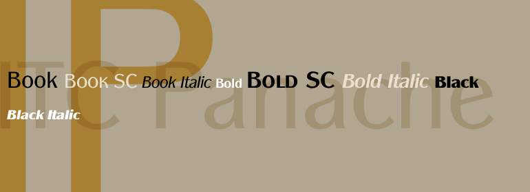
字體圖片