- MD5值:
FF DIN® Condensed
英文名字:DINPro-Cond.TTF
字體介紹
FF DIN® Condensed
品牌:Linotype(Monotype)
設計師:Albert-Jan,Erik
發行時間:2018
字庫編碼:Unicode
分類:無襯線體
字體屬性:
1994年, 在舊金山, 阿爾伯特-簡·普爾和埃裡克·斯皮克曼討論瞭普爾的前景, 斯皮克曼知道他朋友的雇主剛剛倒閉。他建議, 如果普爾想在類型設計上賺一些錢, 那他就仔細看看OCR和DIN一探究竟。這對普爾來說似乎很奇怪, 但一年後,FontFont發表瞭他的FF OCR-F字體,緊隨其後的是FF Din。
斯派克曼敏銳地意識到, 對於想要使用這類字體的設計師來說, 缺乏選擇。數字DIN字體是可用的時候,但隻有在純粹的幾何形狀的兩個砝碼。傢族字體具有5個字重,他增加瞭真正的斜體, 也增加瞭一些替代字符, 如圓點的 "i" 和 "j", 以及舊式的數字。隨著時間的推移, 5個權重增加到 7個, 增加瞭壓縮的寬度, 以及希臘語和西裡爾語的支持。
在形式上,FF DIN從先前版本主要是在其光學調整水平和垂直筆劃的不同是更好地平衡和整體其曲線是平滑的。盡管簡陋,技術的外觀和明確提到德國的高速公路標牌,FF DIN迅速成為一種現象。該字體已經彌漫企業和出版物的排版,可在海報文化機構中可以看出。
2011年,紐約現代藝術博物館增加瞭其永久收藏的第一個數字字體。由於部分或許是自90年代中期發佈的FF DIN取得的巨大聲望,這是被列入的隻有23設計之一。FF-DIN作為當代設計畫廊“標準偏差”裝置的一部分在MOMA首次亮相。2015年,該傢族增加瞭兩個新砝碼和新的希臘語擴展名。2016年,德國類型設計師Yanone與fontfont foundry一起出版瞭FF DIN的阿拉伯語版本。
1994, in San Francisco, Albert-Jan Pool and Erik Spiekermann discussed Pool’s prospects, Spiekermann knowing that his friend’s employer had just gone out of business. He suggested that if Pool wanted to make some money in type design, that he take a closer look at neglected faces such as OCR and DIN. This seemed strange to Pool, but one year later, FontFont published his FF OCR-F typeface, followed closely by FF DIN.
Spiekermann was acutely aware of the lack of options for designers wanting to use these kinds of typefaces. Digital DIN fonts were available at the time, but only in two weights of purely geometric shapes. Pool designed a family of five weights. He added true italics and also some alternative characters such as “i” and “j” with round dots, and oldstyle figures. In time, five weights grew to seven, and a condensed width was added, as well as Greek and Cyrillic language support.
In form, FF DIN differs from previous versions primarily in its optical adjustments—horizontal and vertical strokes are better balanced and overall its curves are smoother. Despite its primitive, technical appearance and a clear reference to German motorway signage, FF DIN quickly became a phenomenon. The typeface has pervaded corporate and publication typography, and can be seen in posters for cultural institutions.
In 2011, the Museum of Modern Art in New York added to its permanent collection its first digital typefaces. Due in part perhaps to the immense popularity gained by FF DIN since its release in the mid-1990s, it was one of just 23 designs to be included. FF DIN debuted at MoMA as part of the “Standard Deviations” installation in the contemporary design gallery. In 2015, the family was enhanced with an addition of two new weights and new Greek extensions. In 2016, German type designer Yanone published an Arabic version of FF DIN with the FontFont foundry.
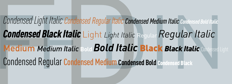
字體圖片